


Looking at these custom made Turkish notes, I really liked how colour and pattern merged together. Throughout these designs you see the use of more subtle colours and more iconic images. Although I am not very aware of politics in Turkey, I can see that each banknote has something iconic about it and has an impact on the eye. I like the use of various colours combining together to create each face/structure. These banknotes remind me of British banknotes that have the image of the Queen and other royalties within family.
Personally I really like the banknotes because they are creative, minimal and eye catching. I also like how the designer has thought about each of the bank notes having a hologram within. Each banknote also have a hologram of the Turkish flag which again relates back to patriotism and how something as small as a flag can be so personal to each country and identify they differently to another country.


Whereas looking at these designs you can see that they are trying to change the way we vision banknotes. Banknotes are normally very traditional with subtle colours and something patriotic. Here we have various time differences highlighting the importance of America with iconic images such as the landing on the moon or Albert Einstein. These bank notes already have created an impact on me by using the images as black and white and having everything around them very geometric and vibrant. Each design has a similar pattern whilst changing each colour to make them more independent whilst working together. These banknotes look very interactive and futuristic. A lot of banknotes are taken very serious however, with a digital world, I believe something like this could be the future. These banknotes celebrate influential scientists and scientific explorers and what they have accomplished. Each banknote has a speech bubble that makes it more fun, quirky and playful.

For the designs below the artists have used pattern design to use within their banknotes. These banknotes were designed to be used within Canada, United States of America and Mexico. Each pattern used is matched to that country. I believe it is important to research pattern design as it could have an influence on your design. For this pattern design the designer has made each banknote more vibrant and eye catching. The use of colours makes each banknote personal to that country. The colours are vibrant but subtle, therefore the colours are not dazzling and too harsh to look at. The grids above that have been used throughout the designs have made them more dynamic, fluid and emotive. The various colour combinations are applied to each foundation of each banknote.


A selection of all the banknotes using various patterns to differentiate each design to each country.


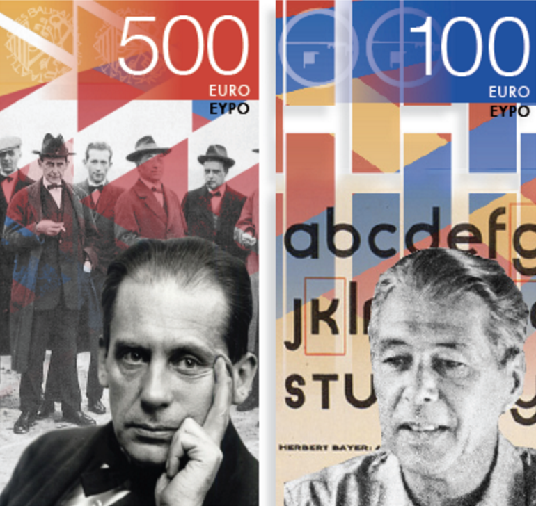
Looking at the front design we have an image that is black and white and consists of borders which have different colours to differentiate the two banknotes. I am also a little bit confused as to why each design print on the bottom left of each banknote has to repeated 3 times throughout the designs. Although I like the simplicity of this money it feels more like a leaflet than something iconic that would be used as money.
No comments:
Post a Comment