Saturday, 30 April 2016

OUGD505 - Studio Brief 01 - Further development

Carrying on from my previous post, I decided to turn the stroke into a fill and already it created more of an impact. Although other than the colour choice, nothing else feels feminine or matching my concept of promoting gender equality. 
I then decided to make the image slightly smaller and involve my henna designs within the mosque outline to make it more targeted towards women. Although when I put the design within the mosque outline it felt that the outline was losing it shape and became less visible as a mosque and more like a pattern. 

Trying different patterns that were lower to the mosque outline so that the mosque is more visible with the pattern to support it. 

After asking my peers in my class it was clear that the iconic image was too small in the previous designs. I decided to go back to a bigger outline and scale up my henna designs so that they had more white space within the mosque outline. I was also playing around with the type and seeing where it was best positioned and whether it worked. 

 Experimenting with type layout. 

I then decided to make the henna design pattern as the outline of mosque and it make more of an impact on me and other peers in my class. It matched my brief of promoting gender equality as well as matching my research of having something iconic which was the mosque  to match my banknote. 

OUGD505 - Studio Brief 01 - Development

 I started of with simple layout experiment. I decided to get some random Arabic writing just to see in what position the text would lay best. I also decided to choose United Arab Emirates as it is known that woman do not have the same rights as men would. 

I decided to go with the typeface KacstBook medium as it has a nice curve on the top that relates Arabic writing as it is very quirky and curly. I also think it suits the theme that I am going for with a san serif typeface. 

 For this design I decided to use one of the patterns that I traced over within my initial ideas and try to bring forward something that would represent woman. Therefore, I decided to use henna designs as they are mostly seen on women and would make this banknote more directed towards women and showing equality. 
The colour choice was to represent woman. I didn't want to choose an obvious pink that girls would choose but a more darker expressive pink to represent both girls and women. For both of these designs, I played around with the layout and the positioning. 
 I wanted to create something that could show equality within my designs. I decided to duplicate the design and make the design on the right half with a fill colour whilst having the background colour stroke on and vise versa for the other side. This shows two different side and transfers the message of equality. 

 I then decided to simplify my designs by using an iconic image of a mosque to represent the country. However, I didn't get an understanding of gender equality from this. It only told me more about the country. I wanted to create something iconic as you always see something iconic on banknotes. 
I then decided to bring the two together. By moving the mosque and henna design to opposite corners they then represent the country and the campaign for gender equality. 

Friday, 29 April 2016

OUGD505 - Studio Brief 01 - Initial Ideas

I retraced some henna designs that consisted of various patterns to which I then scanned them into illustrator and will be using them further in my development. Henna is now part of everyday lives in a lot of places and this is something that is mainly seen on women. Therefore, I wanted to create something symbolic that would represent woman within my banknote. Many people are very curious about henna designs and their meanings and I think this could potentially make my banknote stand out.  Flowers within henna designs are meant to mean joy and happiness. I am using the happiness from these designs to celebrate gender equality through the banknote. A flower means grace, sensuality, purity, creativity but especially femininity. This is a perfect way to address something feminine through designs that bring joy and happiness. 

The next design that I traced was a lot more detailed and precise. I wanted a variation of simplistic designs as well as ones that are more precise. A lot of henna designs are very detailed and are very free flowing. A lot of henna designs are free flowing, have scattered patterns and are ideas for all occasions. The design is scattered with patterns and consists of vines and dots resulting in a very discreet look. This makes it both captivating, eye-catching and fabulous to look at. 
After tracing various henna designs I decided to go to the lightbox and use these patterns within my own banknote designs. What I liked most about these initial ideas was that they looked like something that I have never seen. I haven't seen henna mixed with banknotes before as well as a banknote being used towards a campaign for gender equality. 

These banknotes are very precise but still consist of white space to let the other detail such as the currency number and the Arabic writing that is currently placed with lines. The 3 designs on the left don't have that something iconic like past banknotes have. Therefore, I need to think of creating something that could potentially be iconic enough to represent that country. 


After looking at my previous research I noticed that I needed something iconic. Therefore, I decided to do the outline of a mosque that would represent that country. By using an iconic image of a mosque from the United Arab Emeritites I have linked it back to that country. However, it lost its feminine touch by placing an outline of a mosque across the bank note.  

The two remaining ideas consist of more detailed designs as well as better positioning of the text. Although I am still unsure about the size of the henna designs these designs are very intricate and inform more about henna designs. 

Here is the first layout draft of my banknote. It is simple with two colours that are both complementing one another. The gold gives more wealthy, feminine and original ideas whilst the black represented the henna designs. Although I do like the two colours used against each other. I think it needs to be more easily represented as gender equality. 

Thursday, 28 April 2016

OUGD505 - Studio Brief 01 - Romania money research

After going to Romania with Paayal Makdani we both found it interesting how the Romanian paper was so traditional yet the paper was not able to crease or to be ripped. Romania introduced a plastic banknote, which the government says is rip-resistant, virtually impossible to counterfeit, and won’t melt in the dryer or freeze in the winter. This is something that would work within my designs as it would show harmony, and unity. By the paper not being able to rip it represents gender equality and how everything should work together and not against each other.

What I like about the banknote is that it has modern features of non ripping paper however, it is still very traditional with how it has been designed. I also like that they have someone iconic within their designs and makes it feel like an iconic individual country. Some of the banknotes consist of iconic architecture whilst other contain iconic members. Each note is identified with a different colour and to me the designs look as if they get more intricate and more 'worthy' as the price of the Leu gets bigger.  

The polymer-based banknote is the first in a series, and includes holograms, metallic elements and a clear, see-through window designed to make them harder to counterfeit.I personally really like the idea of holograms and see through designs making it harder to fraud money. I also think holograms and see through designs are the future of banknotes.

For my own banknote I would like to try to create a design that would be see-through relating back to the future and making changes so that it would be harder to fraud my money. I also like how every bank note is different and changes dramatically in colour. Personally, I really liked these bank notes and will be using them to further my research.


Wednesday, 27 April 2016

OUGD505 - Studio brief 01 - Henna research


I decided to do some research into henna designs. You can tell it takes a very steady hand to apply the henna correctly. The designs themselves are very beautiful, complex and precise. You can see how any big mistake is going to be easily visible. I looked at Paayal Makdani's cousin on Instagram who has been very influential in helping me create some designs of my own. 

Henna tattoos are created in a number of shapes and symbols, and many women prefer henna flower designs for the feminine, delicate look of the tattoos. For my banknote I am creating a feminine banknote to promote gender equality in countries such as the United Arab Emirates who do not see woman as equal to men.

What I love about each henna is that each design has its own meaning. For instance, a peacock is a sign of fertility as well as love and good fortune. What I like about henna is that it tells a story much like a tattoo. Henna is something that is normally seen on women and I believe this would be perfect to use within my banknote designs as its directed towards woman and it shows a feminine and delicate touch.

Henna is used primarily as a body-colouring agent for aesthetic purposes, that we have known today. But before, henna is not solely used as a substitute to the more permanent tattoo ink. Back then, henna was used in different purposes including adornment for special cultural occasions, cure various skin diseases, and even treat several health problems with common farm animals and household pets.

Images of flowers buds are an indication of the new life and a sign that love with flourish. 
The peacock is a sign of fertility as well as love and good fortune.  

Images of henna that I found interesting and creative.


Tuesday, 26 April 2016

OUGD505 - Studio Brief 01 - Research into Islam (British Museum)

After the money exhibition I had a vague idea of what I wanted to achieve. I wanted to look at Islam as I was already fascinated by the patterns and the religion itself.  By doing so I decided to visit I decided to put all my images together on Imgur to show the variation of research that I have done.  http://imgur.com/a/Qvv64


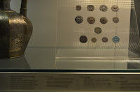
They even had currency within the exhibition. The currency looked very ancient as everything was hand made. The detail on each coin is very precise with again something iconic like a picture of a human or something that could be represented as God. 

Looking at the vases and the patterns that are done so naturally by hand. 

Looking at objects that are either stone or metal and how different the detail within the patterns are.  On the image on the left there looks like a man riding an animal of some sort showing power. Whilst the patterns within the man are scribbles of some sort. The image on the right is carved onto the metal and is very precise with various patterns throughout. Overall, I love how precise each bit of detail is done within both of these circular objects. 

Looking closer at the finish of a ceramics piece. It shows how precise you have to be with the detail. What I love about this pattern and this ceramic piece is that it has human error on it. You can see that the painting isn't exactly accurate and this is something that you do not see very often anymore. 


Monday, 25 April 2016

OUGD505 - Studio Brief 01 - Research inside the British Museum (Money exhibition)

After going back home to London, I took the opportunity to go into the British Museum to look into the money exhibition. Here is a link with all the images that I collected put into one file. http://imgur.com/a/Bkwaa

The gallery was a display of money from prehistoric times to the present, some ageing back to 4000 years ago. For me this was the perfect stage to find out how money started and what influences might have influenced that country to create a banknote/coin. With everything advancing whether its thousands of years ago or today, the world is constantly changing as is money. Money has always been an important part of human societies. Looking at money it has given us the understanding of the history of the world. 

Even looking at some of the earliest coins and how they were made really does influence already what I could create for my brief. 
Looking at these coins you can already see how something iconic is already being printed onto these coins. These coins had a design on one side and the other side was marked with simple punches. I really like the simplicity of the design and how ancient these coins look. 


Even looking at one of the first machines to make coins was inspiring. This was a steel die and roller for making coins.


Although what I mainly came to see were the banknotes. As I saw these banknotes I noticed that the images were black and white whilst the borders around had a more subtle colour; much like my previous research. 
What I liked about these banknotes was how intricate the borders were whilst the note still had space around to work with. The image of the man who clearly was iconic to the banknote as he has a circular border around him. If I am going to use an iconic image I could make it black and white to make it relevant to past banknotes. 


These bank notes are very different and nothing that I expected to see being exhibited. Nonetheless, this Disney dollar note was one that stood out to me. After being brought up around Disney this was a banknote that had a lot of imagination and creativity. The mickey mouse figure in the middle has the positioning as if he is reaching out to you. 
As most of the banknotes that I saw previously had the iconic image as black and white and the borders as subtle colours, it was nice to see something different that I personally believe worked. Mickey the mouse is in vibrant colours making it more friendly whilst the 'Disney Dollars' type is an old western American typeface matching it to Disney. These Disney dollars could be used as payments in some Disney resorts. 
I also liked the Harry Potter coin and the Wile E. Coyote phone card. They both brought it in an element of fun that makes it more personal to the child. From looking at this research I can take forward the fun element and how everything is pretty much the opposite to an actual banknote which in my opinion makes it more intriguing. 

Korun banknotes came following the Second World War where the political and military influence of the Soviet Union led to the creation of number of communist states. These images were used to suggest progress, military strength and well-being. What I liked about these banknotes was that they were influenced by something. Therefore, showing how much of an influence money can be. I want to take forward the simplicity of each of these designs and how they were used to suggest a message. I also like the simplicity of the designs within;  '50' which is easily legible, as well as the simplicity of the images used. I also liked how they used one colour. 

Sunday, 24 April 2016

OUGD505 - Studio Brief 01 - Research(2)


Looking at these custom made Turkish notes, I really liked how colour and pattern merged together. Throughout these designs you see the use of more subtle colours and more iconic images. Although I am not very aware of politics in Turkey, I can see that each banknote has something iconic about it and has an impact on the eye. I like the use of various colours combining together to create each face/structure. These banknotes remind me of British banknotes that have the image of the Queen and other royalties within family. 

Personally I really like the banknotes because they are creative, minimal and eye catching. I also like how the designer has thought about each of the bank notes having a hologram within. Each banknote also have a hologram of the Turkish flag which again relates back to patriotism and how something as small as a flag can be so personal to each country and identify they differently to another country. 


Whereas looking at these designs you can see that they are trying to change the way we vision banknotes. Banknotes are normally very traditional with subtle colours and something patriotic. Here we have various time differences highlighting the importance of America with iconic images such as the landing on the moon or Albert Einstein. These bank notes already have created an impact on me by using the images as black and white and having everything around them very geometric and vibrant. Each design has a similar pattern whilst changing each colour to make them more independent whilst working together. These banknotes look very interactive and futuristic. A lot of banknotes are taken very serious however, with a digital world, I believe something like this could be the future. These banknotes celebrate influential scientists and scientific explorers and what they have accomplished. Each banknote has a speech bubble that makes it more fun, quirky and playful. 

For the designs below the artists have used pattern design to use within their banknotes. These banknotes were designed to be used within Canada, United States of America and Mexico. Each pattern used is matched to that country. I believe it is important to research pattern design as it could have an influence on your design. For this pattern design the designer has made each banknote more vibrant and eye catching. The use of colours makes each banknote personal to that country. The colours are vibrant but subtle, therefore the colours are not dazzling and too harsh to look at. The grids above that have been used throughout the designs have made them more dynamic, fluid and emotive. The various colour combinations are applied to each foundation of each banknote. 


A selection of all the banknotes using various patterns to differentiate each design to each country. 
These banknotes are bolder and consist of a lot more colour and precision. Personally, I believe these banknotes have too much information on them and have too much going on within them to understand. Although I like the use of transparent colours going over each other to create intricate patterns when you place an image next to it, it loses it creativity. I also don't particularly like how on the two bank notes everything is very different to one another other than the placement of the image. Everything feels too complex and it feels too old-fashioned.   
How the two designs look printed. 
This is a banknote that I found on Behance and noticed the use of a mosque. I like the simplicity of the illustration of the mosque however, I am not bought on the size of each lettering. When looking at past banknotes created by other designers I noticed that the numbers and typography are very small and this lets the designer put something on that's going to be more patriotic and iconic. Here is a design that limits the banknote from being patriotic and instead focusing on the currency number.  The number 10 almost looks as if it has been stretched and is already taking up half of the bank note.  Although I don't like the size of the type I do like the simplicity going on behind the typography and this is something that I will take forward. 


Looking at the back of the design, I almost forget that these two bank notes are corresponding to one another. The typography is smaller than the front of the design whilst the iconic image of a mosque is then transferred onto the other side and made a lot smaller. I also don't really understand the meaning behind the world map at the back as it doesn't direct to a certain country and makes me rather confused as to what this banknote has been created for. 
Again, within this design the designer has tried to overcomplicate the design. The colours here work less so than the colours above. Within my own designs I need to make sure that the banknotes are iconic and easy to understand. I also need to make sure that the numbers that I decide to choose will not be placed throughout the whole of the bank note as well as choosing suitable colours to make my banknote more recognisable and iconic. 


Here is a design that I can agree on one side but I don't understand the message behind. 

Looking at the front design we have an image that is black and white and consists of borders which have different colours to differentiate the two banknotes.  I am also a little bit confused as to why each design print on the bottom left of each banknote has to repeated 3 times throughout the designs. Although I like the simplicity of this money it feels more like a leaflet than something iconic that would be used as money. 
This is a design that I am very confused by. I don't really understand the point of using so many various colours which just clash against each other therefore, making it harder for it to be more easily legible. If I was to redesign this banknote I would not use the same colours throughout two different banknotes. On the design on the right, we have a vivid blue banner however, on the design it uses various colours such as red which also clashes with the design on the left. Therefore, I could never see these designs working in the future. I also think everything on the back is scaled too big and needs to be re-designed.