Today was our first concept and practice
study that I thoroughly enjoyed. We were
asked to bring in 3 different typefaces that varied significantly from one
another. The three letters that I chose were;
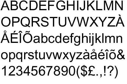
Arial
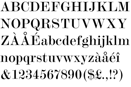
Modern no 20
brush script mt italic

We then had to swap letters with someone on
another table and write/describe our opinions of the letter(s). This then led
to us choosing our favourite typeface. In the end I decided to choose Modern no
20 because it’s quite quirky and has a variation of strokes and this would make
it more interesting to work with in the next task.
Here are a few notes that I took about
modern no 2.
-Varied strokes
- unique ended stem (lower case b)
- unbalanced
- irregular
- decorative
- serif
- crossbar on the a, compared to the rest
of the letter
- aperture on the letter a
- flat serifs
We were then asked a group to choose 3 out
of the 8 we had all chosen and combining the three and seeing what it would
look like as one letter. We decided as a
group what was the most dominant feature in each of the 3 letters we had
chosen.
We then decided to have 5 key points that
we would want to show in our letter. This was weight balance, sans serif with
serifs, elegant, irregular and unique.
We had all agreed that we wanted flat
serifs, varied strokes and a curve attached to each stem.
This is what we ended up with.
We decided to call it kefeirville because
it consists of all 3 of our fonts.


Our other task was to describe our main
description from the letter onto someone. We then dressed up Chris to represent
our word irregular.

No comments:
Post a Comment