Tuesday 25 November 2014

Photography induction

Today we had a 2 hour photography induction showing us how to use our camera and where we can go to borrow equipment. I think the induction was very interesting and has made me want to learn more about cameras as there is a lot to learn. We were then given 45 minutes to go play around with the camera and these are my final outcomes. I think I will go back and revisit the camera and how to function it properly.


Sunday 16 November 2014

Evaluation of my module (OUGD403)


For my end of module evaluation I believe that the briefs went very well and I was satisfied with my final outcomes in general. I believe I have learnt a lot through this process especially using grids to make new letters as well as using grids to layout my work in InDesign. I enjoyed working in groups especially because we could bounce ideas of each other and we got to meet new people throughout the process and find out their skills and weaknesses.  What I enjoyed most throughout the module was creating my final lowercase letters and seeing the final product. I was very satisfied with my final outcome for the letters and was complimented by Simon and my friends for creating a typeface that looked peaceful. 

What I think I could do to improve is to blog more often and stop writing out the blogs and not publishing them. I feel that I participate in a lot of briefs and activities however I occasionally forget to transfer what I’ve learn/done onto my blog. I think this has been a massive learning step for me about the real world and what clients might expect from us. I hope to learn more throughout the year and am excited to see the next briefs. 

What I found difficult was the last brief and creating posters that would be seen as efficient and worth reading. I wanted to avoid using posters such as the NHS which people see and ignore normally because they are not visually effective. I wanted to create a set of 3 posters that would all transmit the message of ‘how easy it is to donate your heart.’ I was genuinely happy with the final outcome however, if I could go back and change my work I would work on my posters more to make them look more like a set rather than a message.  I think my research however, was very thorough as I enjoy researching something that I find interesting. 


To conclude, I think I could blog a lot more and I could use my notebook into practice a lot more. Another thing I would like to improve is photoshop. I attempted my best with photoshop for my final design in studio brief 04 with the help of Drew and think it went quite well as I am not very good with photoshop. However, I think my skills with illustrator have improved and I hope they continue to improve as we progress further and further into the year. Another thing I would like to improve is to design my design boards as I go along because they are quite time consuming and if I hadn’t started them earlier then I would of panicked to get it on time. One more thing I would like to do is to start reading the books that I have bought as I haven’t had enough time to even start them. I hope to start reading them during this week and when we have a bit more time off. 


Final Crit (OUGD403)

Today, we had our final crit which I believe was very beneficial to me because my friends noticed things that I haven't.

In my crit, I was told that my choice of font was very good in my text and image poster and that its clear that I put a lot of effort into these. At first I was struggling with these posters however, with everyone's support and my friends helping me I am aware of what needed to be done. I am also aware that I have used 3 colours instead of two for my image only poster.

I was also told that my posters could be more visually similar and I couldn't agree more now that I have seen some of my friends works. I do however feel that I have still accomplished well in this brief because I misinterpreted the brief and I thought all three posters had to convey the same message and had to work as a set in that format. I believe I have learnt a lot from this module and hope to continue working as hard as I believe I have.

Text only. 

Image only. 

Text and Image

Negative space (OUGD403)

We were given the task to design something that would consist of negative space. It could be subtle and it could only be one word. We see a lot of negative space designs used in logos such as the FedEx which has a subtle arrow in between the e and the x.
Another one is the key which consists of houses as the cut out. It is an American Institute of Archictects Center logo. 

At first I struggled to come up with a word that could be used with negative space. I then decided to think of various words that I enjoy and one of them was 'fashion'. I then decided to kern all my letters together and started playing around with the shapes of some letters. Here is my final outcome, I hope you can see the subtle negative space in this image. 


Monday 10 November 2014

Promoting a cause (OUGD403)

Whilst researching my posters I decided to look at ways of promoting a cause. There was one cause that especially grabbed my attention.

https://www.youtube.com/watch?v=eBuC_0-d-9Y

The Pilion Trust Charity
This is a charity that had one man dress himself with board saying 'Help the poor' get no attention. Everyone goes past him and no one acknowledged him and his charity work. The following day the same man work a similar board on him saying 'Fuck the poor'. This new approach sees the public turn an eye and question him and even throw things at him. This shows how ignorant we are to things we see on a daily basis such as helping the poor. I really enjoyed watching the video because it shows that we ignore things such as charities on a daily basis however, when we go against something as big as the poor then we realise that we do actually care.

I wanted to share this because it shows that we as a whole do care and do want to make a difference. I hope to take some of these positives and possibly try it in my own work.


Interim Crit for posters. (OUGD403)

Today we were put in separate groups to crit each other on the initial ideas that we have come up with for our posters. Sadly, I don't believe this crit was as useful as any other crit we have had. I think this might be because I had too many generalised ideas and no one could really help me choose the right path. I was vaguely told to think about choosing something that would inform people of how easy it is to actually offer yourself as a heart donar.

I think I did a lot of research into my work however, I hope to get a small group tomorrow to go further into my designs and pick a direct path for my posters.


Fire Exit mini brief

On Friday we were given a mini brief to design a new fire exit sign.
I think this brief went a real success because we started playing around with technology and how its advancing and how signs should also advance.
We first started at looking at advancing technology and whether we went past something that made up stop. Two people from our group go past the Yorkshire sculpture park everyday to get to and from college and have noticed the running horse. This was our starting point of using moving animation to inform our viewers. We wanted the sign to be universal and not consist of any words as people from other countries might not understand the words 'fire exit'. We therefore started by using fire as a way of starting to get people to understand what is happening and changing the animation of a fire as it went more serious.
We wanted to keep to neutral colours for when there is no activity of fire. We decided to colour the first animation in green to signify a neutral state of mind. Our second animation was a slight orange informing the people around that there is a sign of fire and to exit the door. Our last animation was a vibrant red and orange contrasting against each other signifying the importance of getting out as soon as possible. We also thought of including a speaker within the door sign just incase anyone has reading difficulties or is blind.
Here are our outcomes


Final Crit for Alphabet Soup (OUGD403)

We had our final crit today which in my opinion went very well. I decided to present my work on matt paper with 3 different designs.  I started by looking vaguely at Times Roman which didnt look too peaceful and after discussing with my friends especially Liam Sayer we decided that my typeface should be more subtle in order to achieve my final outcome. I started off by taking off the serifs and making it more curved. I wanted the 'peaceful' to feature smooth, loving, friendly and neutral.
My typeface was originally different because I felt that the crit was too short as I ran out of time. (I was the last person in my group).


My first page consisted of my lowercase alphabet. I believe it was a real success because in my crit everyone including Simon believed that it looked like a typeface and it demonstrated peaceful. I got told that the letters are minimalistic and are easily readable. 


I decided to print the word peaceful to see whether the type produces what it says 'peaceful' 


The last page I decided to print was a pangram which consists of every letter. 

I think that the letters work together and have features of the word peaceful. I was very satisfied with my final outcome and have learn a lot from this brief especially with illustrator. 

Another group crits us (OUGD403)

Crit by another group

Today we had a crit and initially we were told that ours looked quite good and matched the brief however we then had Simon ask us to be a bit more understand and to crit as much as we could as it could only benefit us and this helped a lot. We were very soft to one another at first but then got the board rolling and this helped us to improve our work.
So what we decided to do was to include a quotation mark that would sit around the text so that our magazine page would look like less of a tabloid. 


Sunday 9 November 2014

Poster Research (OUGD403)

Today, we have been given a task to research about posters and what their purpose is.
 
The first set of posters I have decided to have a look at are propaganda posters. 
I've decided to look at Abram Games and his contribution to propaganda.  Abram Games designed various propaganda posters during World War 2. The most iconic poster in my opinion is 'Use Spades Not Ships' This is a poster to try encourage people to grow their own food instead of relying on ships. The poster combines an image of a ship with a spade that contradict each other. The ship is made to look like a spade. 1"Britain had imported 55 million tons of food each year." This shows how much Britain relied on ships bringing in food to ration. This encouraged the germans to target ships and take down as much import of food as possible. 


Neville Brody 
The Face and Arena Magazine Covers – Designed throughout the late 80s
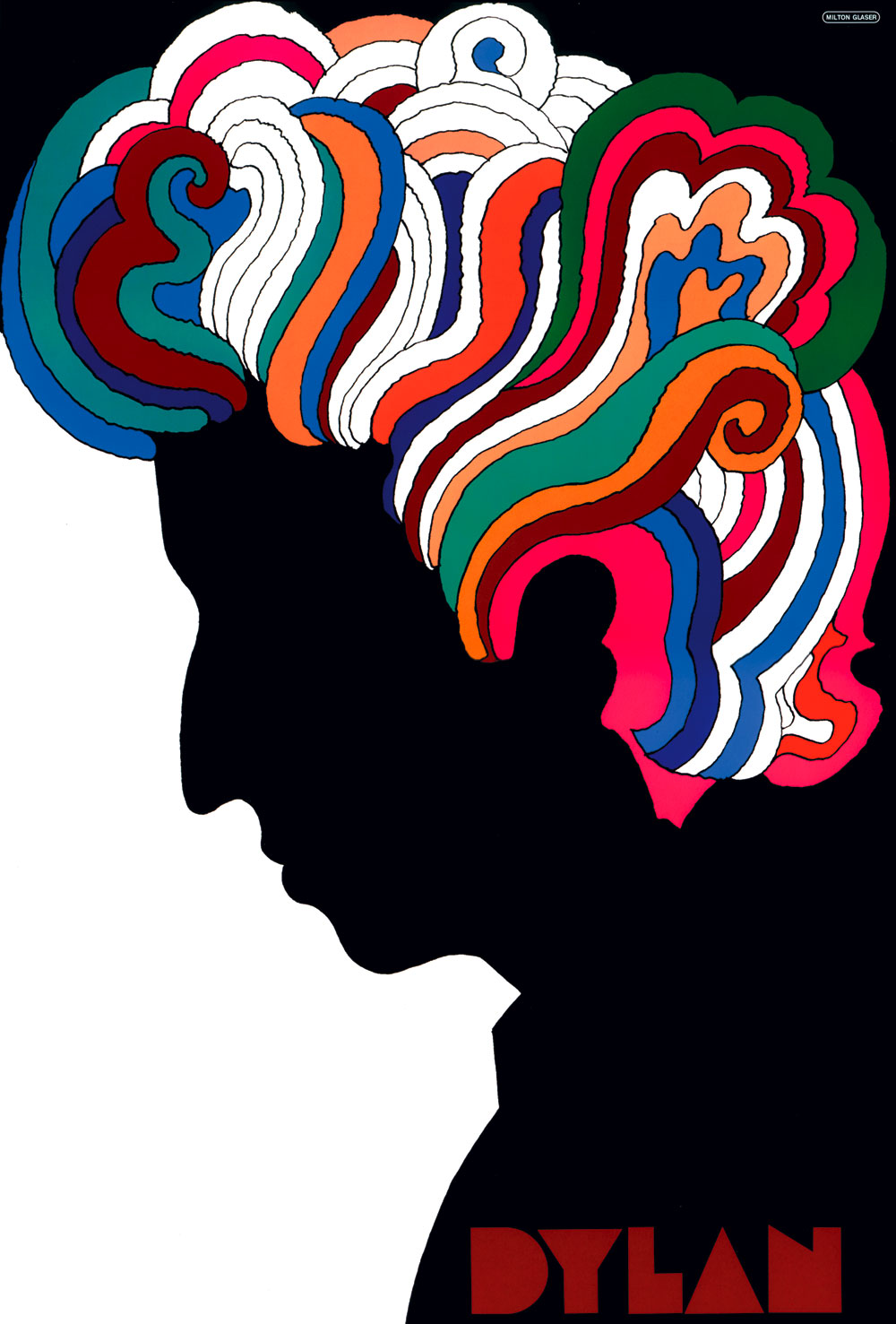


Milton Glaser 

He is an influential graphic designer who created numerous iconic posters. He is most famous for creating 'I Love New York'. A poster that Milton Glaser designed that is seen as very iconic in my opinion is the Bob Dylan greatest hit album in 1967. The influence behind the poster was Art Nouveau and the use of colours and shapes made. Glaser wanted to create something that was modern and would consist of the phrase "less is more".  He even created the typeface himself to make the image more personal. Six million albums were sold and it became a collectible that is now sold for $100 or  $200 with his signature.  
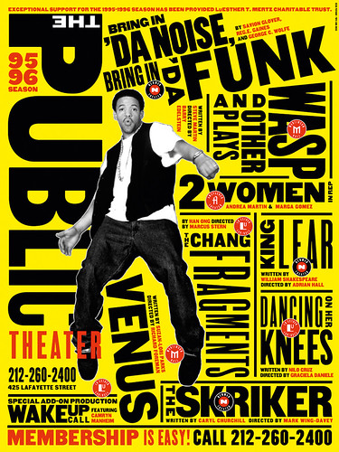


Paula Scher 

She is a postmodern designer who often went again the modern view. Everything that was created would go against the grid system. This poster was Schers most iconic poster in my opinion as it was revolutionary and went against everything. It's a unique and funky poster with type going in all sorts of directions.  


1. http://www.iwm.org.uk/collections/item/object/10305

Final Lowercase letters completed. (OUGD403)

Here are my final letters completed. I started off with lowercase as it appealed to me as more peaceful than uppercase. I believe I did a good job and hope to experiment more with these letters before the deadline.

Heart booklet presentation (OUGD403)

Today I had to present my research. I had attempted to create a booklet but ran out of time and couldn't manage to place them in the correct format to make it a small booklet. I have instead placed JPEGS of what information you could have seen in the booklet. I think it was still a successful presentation because it was on the computer as well as giving handouts to everyone.
I believe I did quite a lot of research into this brief and I have enjoyed researching into the advance of technology.


Colour theory (OUGD404)

Today we had to bring in 5 items that were mainly yellow.

Out first talk was to put the items that we all collected as a group and place them from light to dark and then separate them after into warm or cold colours. I think this task was efficient as we started looking at various colours and made us work together to come up with a final outcome.
I enjoyed the task and have become more understanding of colours, especially primary colours.