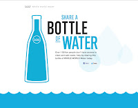
This brief is asking to produce a message that will get across to people. It has to communicate something short and recognisable. I have looked at several poster designs that use typography to further their messages. A lot of these campaign posters are straightforward and clean. It is important to not overcomplicate a design as a campaign poster should target ages 16+ in my opinion. In a campaign like The Water Project it is important to not have a specific target audience as you need as much support as possible. From looking at these posters I am going to focus on type and making it powerful.
I like the slogan 'share a bottle of water' and intend to use something similar for my own design. I like that the campaign is based on something so simple that it makes you think. It makes you think in the way that all you are doing is sharing a bottle of water which could change someone in a third world country.
We are aware that the water in third world countries is not filtered or clean and therefore requiring walking miles for some water for their children. This is a successful poster because it makes you think with the simplicity of colour and text. The text chosen is bold, eye catching and makes you stop and think. The two glasses are both proportionate however you almost feel as if the dirty cup has been altered because you can see the water in the first cup but not so much in the second one.
This poster uses a child playing with a toy duck whilst the message is showing a strong message for the campaign. This campaign shows how much water we waste by just having a bath. It's trying to get across that the amount of water that we use for a bath can save lives in other countries. As a first world country we can forget how lucky we are to have everything given to us. This is something that I want to get across in my campaign - showing how much different water can do to someone.
A water tap that has been flipped upside down. The end of the tap now has a small tree growing showing how important water is. It is trying to get across the message that saving water can save lives. By turning off the water taps we are preserving water and using it elsewhere where it is more needed. This campaign is straightforward and very easy to understand even though it doesn't use much text other than the message which in my opinion is too small.


No comments:
Post a Comment