Friday 22 January 2016

OUGD503 - Secret 7 - Final Outcome

Here are my final two album covers that I created for my Secret 7 submission. 

Jack Garratt - Worry
I decided to put in an illustration of a woman with red lip stick instead of focusing on purely the red lip stick as I have in my previous designs. The jigsaw pieces are meant to represent the lyrics:

"My nights are broken up by the sounds of women I’ll never meet
And when my eyes are closed I can start to feel you staring at me.
Pick apart the pieces you left"

The woman is meant to have pieces missing showing how he is picking up the pieces of puzzles that she has left behind hence why the piece isn't fully complete of the woman.


I decided to go back to my notes book and play around with the brush stroke. I decided to use the brush stroke that I used in my development and expand it so that there is more subtle blue with bits of white on it.

A white dove symbolises peace for its purity and serenity and relates back to the word heaven. The song is very calm and touching and I thought it needed to be minimal whilst being subtle with the doves which are all flying up towards the heavens.


"The skies above are blue My heart was wrapped up in clover The night I looked at you"

"Oh and then the spell was cast
And here we are in heaven
for you are mine..."


Friday 15 January 2016

OUGD503 - Secret 7 - Development

Etta James - At last.
With the use of skies and blues I created my own brush stroke and then started dabbing it around the page. I focused on the word Heaven, Skies and God. Everyones interpretation of God is different and I wanted to illustrate that in this. This reminds me of some higher power that doesn't have a face. We have never seen the face of God so why not illustrate a higher power with no face. The colour is very gentle and warm and links back to the word 'emotion and love'. 
Etta James - At last. 
Again, using a different brush stroke I created something that would remind you of dreams. Dreams are something that your mind makes up and create an image of thought. The centre point is white and slowly drags out further. This came from the idea of sleep that I had written down. As we go to sleep we see darkness and that darkness eventually turns into imagination and dreams. When I designed this thought, black was too harsh and aggressive. I didn't want to get across dreams as aggression but instead something warm with belief. 
Jack Garratt - Worry
This is an image that I thought was reality when I was younger. When I was younger I thought that our body ran like a cog and in a way it does. If one of these cogs stopped working than the others wouldn't turn. The words that I looked at were Headache, broken and damaged. I wanted this body to look as if he was laying his hand on his head whilst the cogs werent connected. The cogs are broken and therefore the reason as to why he is worrying. 


Jack Garratt - Worry 
A simplistic image that I wish I took forward. For me I panic when I think of solving a rubics cube. The Red lips were meant to show the woman who he has last and is now trying to pick apart the pieces. In this situation the pieces are pieced together but they can very easily be disjointed and broken again. I like that the centre is of red lips which instantly directs back to a woman whilst the rubics cube is there to represent worry of it falling apart again. 
Jack Garratt - Worry 
After using the same brush as I have done with my Etta James album cover, I decided to create it more into lips. This reminds me of a kiss on some paper and not all of the lipstick has stuck to the paper. The lips are not exactly lips but they could represent many words that I have looked at; broken, damaged, women, gentle, red lips. 
Jack Garratt - Worry
When I get a headache I feel as if I turn into various people. The most iconic image of someone with a headache is the holding their heads in pain. I wanted to show a change as this man walks from a subtle gray to a dark black to represent the pain he is going through.  
Again, Using the same image I played around with the negative effect of using the word nights, dim and headache. When I think of the word night the first word that came to me as moon. I wanted to represent a man walking through the moon on a dark day with a headache. The use of two colours shows split personality as you see two men; One walking normally whilst the other half above the moon shows him holding his head. 

Tuesday 12 January 2016

OUGD503 - Secret 7 - Initial Research

I always find it easier to have a rough idea of what I want to do with my art work. After mind mapping several words on my previous blog I decided to not look at the lyrics and use those words to try describe what is happening in the lyrics. 


I had to try recreate the word headache which I found difficult at first. I drew a sketch of a face and put lightning strike around to demonstrate the pain of a headache. The strike down the middle of the face is to represent the two sides that you feel when you get a headache. It is showing how split in two you are. 

The eye relates back to the words confusion hence why the question mark in a shape of a pupil. I wanted the eye lashes to be the centre point of attention with the eyelashes being different colours to represent sunshine as it was one of my chosen words. 


 Red lips placed in the centre of the CD cover with puzzle pieces left around. This is meant to show the lips of the girl that he(the artist) will not see again as he picks up the pieces. 

The closed eyes are very simplistic and easy to understand. The eyes almost look disappointed which again I try to show confusion. In the lyrics the woman has her eyes closed and this makes the image more recognisable and controversial as to why she has her eyes closed. 

Sunday 10 January 2016

OUGD503 - Secret 7 - Lyric research

For my album covers I have decided to relate my artwork back to the lyrics. I personally believe that linking the album cover to a song makes the song more personal and visualises your thoughts of what the lyrics might mean.

Here are a selection of lyrics that I will be focusing my design around. 

-----
Jack Garratt - Worry

My nights are broken up by the sounds of women I’ll never meet
And when my eyes are closed I can start to feel you staring at me
The right side of my bed has always left me feeling stuck in between (Oh, oh, oh, oh)
Everything I know and all the lies I tell myself so I can sleep
Pick apart the pieces you left
Don’t you worry about it, don’t you worry about it
Try and give yourself some rest.
-----
Etta James - At last
The skies above are blue
My heart was wrapped up in clover 

The night I looked at you
I found a dream, that I could speak to
A dream that I can call my own
I found a thrill to press my cheek to
A thrill that I have never known

Oh and then the spell was cast
And here we are in heaven
for you are mine...

-----


Saturday 9 January 2016

OUGD503 - Secret 7 - Album research

Avenged Sevenfold 
Designers have a role to set visuals to promote their music. Avenged Sevenfold are Rock artists and you can visually tell in this album cover. By using a dark dim black it exaggerates the skull and the wings to make it look alarming and chilling. The simplicity of the design makes you curious of who these artists are. After listening to Avenged Sevenfold you can instantly relate back to the album cover and why it was designed with such purpose. The theme of the album is expressive in the way that it is crude and evil in a sense. I personally really like how minimalistic it is. 
Green Day
The use of the hand bleeding mixed with a heart grenade really stands out for me. The visuals again make it seem very RocknRoll with the use of a heart being used as a grenade. The words 'american idiot' are also red which matches the red heart shaped grenade. This feels to me as if the colour relates back to the grenade saying that the person holding the grenade is an American idiot. I also like the simplicity of the three main colours black on white with red working together to create a recognisable album cover. 
Nicki Minaj
The use of a strong pink paint of some sort is being used as a way to print what I presume is Nicki Minaj's fingerprints. This album makes it more personal to Nicki Minaj as it uses her fingerprint as the main focusing point. At first I was shocked to find out this was Nicki Minaj's album as her reputation has very mixed media. Her reputation is normally focusing on her backside therefore its the complete opposite of Minaj's usual aesthetic. I also like the use of her album name 'the pinkprint' which uses a strong vibrant pink with the use of her fingerprints. 
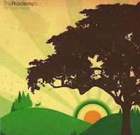
The Academy's
Although I am not very aware of 'The Academy's' and their music I really like how the album cover tells a story. After researching into their songs the song title 'Almost here' talks about how he has "worked in the daylight feeding fashion to housewives"this is the only thing that I can relate back to the album cover. 
What I personally like about the album cover is that it is very vibrant and the trees and the sunshine contrast each other very well here. The album feels warm and welcoming. The sun itself is exaggerated as it uses circles to make the sun look more quirky. I like how the sun uses the colour green with just a very subtle orange to demonstrate the sunrise. 
The XX
This is one of my favourite album covers because of the simplicity and how easily recognisable it is. A huge bold X right in the centre of the album makes me question why only one X and not two X's. But I personally like controversial album covers because it makes you talk more about the design of the work. I myself love monochrome colours and designs hence why I would say this is my favourite album. It also explains a lot about the simplicity of the music which is very condensed. 
The Used 
The album is showing the death of love. The heart represents love and the heart is being hung; therefore it is the death of love. This album cover reminds me of the film 'The Conjurting' which also uses a tree and a rope to show that it is a horror movie. I also like that the typeface looks hand rendered and is also very exaggerated. The background colour is very dim and shady and matches the 'death of love' story.  

OUGD503 - Secret 7 - Brief

As part of our Responsive brief we need to choose two small briefs and a big brief. 
As part of my small brief I have chosen to design two album covers for Secret 7.

This years chosen artists are;

- Chvrches - Clearest Blue
- Etta James - At last
- Jack Garratt - Worry
- The Jam - Art school
- John Lennon - Imagine
- Max Richter - Dream 3 
- Tame Impala - The less I know the better

Album covers are something that can not even relate back to the lyrics. However, I personally find it more interesting if you can relate back to the lyrics. Lyrics are there to make you think. If you can visualise that then it makes it easier for the audience to understand the artist and why he has chosen those words. I intend to make each album cover personal to the lyrics even if it uses just a word. 
After listening to each artist I have chosen Jack Garratt - worry and Etta James - At last because these lyrics relate most to me. This makes me want to design something that would make you think as to why I have designed this.  

Friday 8 January 2016

OUGD504 Studio Brief 03 - Production & Content Considerations

Production Considerations:

Stock used throughout mocks and final:  Softy White - 200 GSM, Matt - 120,200 GSM, Nubuck 270GSM. Peregrina Majestic Marble white 120. White Frost -135 GSM

I created various mock ups using different papers to try 


Print Method: I decided to try create a booklet that smelt like coffee and therefore I attempted to soak my pages into coffee water. I placed a tray on the floor and put a few spoons of coffee with hot water. 


Binding Method: At first I was going to just staple my booklet. However, after speaking to my classmates I was told to try a different binding method because it made the book look like a throw away booklet. 
I decided to use 200 gsm paper to create my final book to make it more heavy and less like a throw away booklet. 

Mock ups / experiments: I created 4 mock ups which were printed on various paper
The mock ups consisted of paper being soaked in coffee as well as going to the local Leeds store FredAldaus


OUGD504 End of module evaluation

For my end of module (OUGD504) evaluation, I believe my year so far has been enjoyable yet challenging. In the last few months I found out that my uncle has severe cancer and I noticed that I was starting to fall behind. In order to stop falling behind I took almost everyday during the Christmas holidays to get my work to the level where I will be satisfied. I have successfully come back and created some work that even professional designers have given me credit which is very pleasing to hear.

Throughout this module I have gained considerable amount of knowledge and experience. Whilst creating my design boards I had a look at my previous work and I believe I have advanced by a lot. My design boards are more thorough and more professional. I have really enjoyed the past few months working on OUGD504. I believe I have a stable foundation to keep getting better at what I do. I am also starting to get a theme of my own within Graphic Design. I am looking forward to perfecting my style throughout the year.

Throughout the module I have created work that I am very pleased with and I can see how I am personally progressing. What I enjoyed the most about the module was the variation between briefs. I liked how one week we were getting a week brief which was very intense to another brief lasting 3 weeks and being able to manage your time. Something that I struggled with last year was time management and now I am managing my time well and if I have an issue I will go up to my tutors and ask without hesitating.

I believe I have learnt a lot already throughout this year. I have learnt more in the past 3 months then I did throughout the whole year last year and that shows how intense this course is and I love the intensity. I have learnt new skills such as creating even more books that I haven’t done in the past. I have learnt to experiment more with my work and to not be afraid of mistakes. Especially with studio brief 03 where I played with coffee to create the typography needed for my front and back cover. I was also not very confident about starting a website for studio brief 04. However, after creating my final website design I was amazed as to how professional it looked and what I was capable of doing.

Although I think I have progressed a lot throughout the last years I still believe there is space for me to improve on. Although I have experimented a lot throughout the last few briefs I still believe that I can do more and try things that I haven’t tried before. I also think that sometimes I look too hard into my work and criticize it too harshly. For example before I went to the final crit for studio brief 04 I thought my website wasn’t up to standard and believed that my colleagues did a better job. Once my turn came I was complemented on my work ethic and was told to be pleased with what I created. This was really satisfying to hear and made me want to go back and make it better; to which I did.

To conclude, I believe my independent study has got a lot better although I feel that I should still try to come in when we are not timetabled to get more advice/help from my colleagues and tutors. I also believe I need to start gaining more confidence in my work and be proud of what I have created. I honestly think I have matured as a designer and an adult and hope to maintain this work ethic that I have going on. In general, I have been over the moon with my final outcomes however I intend to further my research and initial ideas.

OUGD504 - Studio Brief 04 - Final outcome on a mac psd

Here is my final outcome on a mac psd. I am personally very pleased with my final outcome and hope to come back to website design in the future. Website design is something that I though involved coding however, after much research and having visiting professionals I learn that you dont need to be able to code. 
I also learn the importance of wireframes. Without the help of my wireframes I dont think I would have come up with a good final concept in the end. 


Thursday 7 January 2016

OUGD504 Studio Brief 04 - Evaluation

For Studio brief 04, I had to choose an artist and create a campaign that would promote their new upcoming album. I decided to choose Skepta as he is an artist that is renown around the UK and has a very basic one page website currently. At first I created various wireframes and then started to work my way up towards the website. When Only (who briefed us) came back for our final crits I was told that I had a lot of potential in website design and Matthew Tweddle was very satisfied with how I presented my wireframes. This was quite a surprise for me as I am very harsh when it comes to judging my own work as I always want to create the best of my ability.

What I enjoyed about the brief was that we could develop our own websites for these artists. We had the freedom to design our own campaign for their new upcoming albums. Website design is something that I have always been welcome to try but I always thought you had to use coding. This is something that I have learn from the brief and I believe I came up with a good campaign to promote Skepta’s new album. I also enjoyed learning about the artist and understanding what the client might want within their website. Therefore, I created a website that would be specific for Skepta as he has a certain monochrome feel about him and his music videos.

 What I found difficult was creating the tour dates page.  This is something that I spent hours on and really struggled with. I wanted to keep the tour dates page simple so its easy to use but when I created something that was simple it didn’t necessarily match the theme of the rest of the album. Another thing that I found difficult was creating a giff for my front page as it is something that I haven’t tried before. It also used photoshop which is something that I hope to get better at during the year.

If I could go back and change something I would try make the website more social media based. Social media is currently massive and uprising. ‘As of September 2014, 71% of online adults use Facebook’. I would try to use more hashtags within my designs so that people would get this new website trending on social medias. I wish I could learn some coding to create things that would be unique and more interactive for the client. There are currently 600 million websites online and as a graphic designer you have to offer something that those 600 million websites don’t have which I believe is possible.


To conclude, I am satisfied with my final outcome as I have created a website for an artist that is renown around the UK as well as getting praised by Only’s Matthew Tweddle. I am very open minded about trying new website designs and would love to speak to Only to possibly get an internship during the summer. If I could go back to my website I would definitely add more hashtags to get the website trending.

OUGD504 Studio Brief 03 - Evaluation

For Studio brief 03, I had to create a publication from the research we did over the summer holidays. For my summer holidays I visited Montenegro. However, after taking several pictures on my phone I wasn’t happy with the quality of all of them. Luckily, I had photographs of several coffee shops that I saw in Poland. I decided to take these photographs as a backup as well as keeping them for myself. My parents own a coffee shop and I find different typography and different atmospheres within coffee shops interesting. Therefore, I decided to create a publication about Polish coffee shops which were all specifically in Warsaw, Poland. This brief was interesting as this isn’t our first publication therefore, we had to create something more innovative and interesting.

What I enjoyed the most about this brief was that we got more control of this brief. It was also a brief that last longer than one week so it was interesting to see how I would manage my time efficiently. I fancied creating something that was personal and something that I have not tried before. This brief definitely had the most experimentation within it. I created my own coffee paper that was made from placing paper in a tray of boiling coffee. This was entertaining and interesting as it was something that I have never done before and thoroughly enjoyed. I also enjoyed working with coffee to create both my front and back cover. I had created various stencils that were used with crushed coffee beans. Although it was challenging it will be something that I will be visiting again.

What I found difficult was perfecting my final publication. My final outcome was 200gsm therefore the paper was quite thick and was hard to put together. Although I found it difficult to create, I listened to my tutor’s comments and made the right adjustments towards my publication and I agree that it made it look a lot more professional and less like a one day use booklet (thrown away booklet). Another thing that I found difficult was taking out the paper from the coffee tray because the paper was soaking wet and when you picked it up it was very fragile and would easily tear apart.

What I could do next time to improve is to play more around with the front and back cover. After going to Vernon street and creating 3 separate books I then struggled to come up with a good concept for the front and back. I eventually came round to use coffee for both the front and back however, I would like to try to create a perfect bound book with content inside. I also struggled to come up with a good layout at first but with the help of Danny (my year tutor) we got together and bounced ideas from each other and this definitely helped me. Looking back at my first layout and then my final outcome I couldn’t have been more happy with the advice I got given.

To conclude, I am satisfied with my final outcome for this brief. Next time I attempt a publication I intend to use smaller gsm paper as it wouldn’t stick out as much as it does currently. I am also aware that I could use a scalpel to trim off the sides however, if I was to scalpel the sides then the writing would potentially be cut off. I am also very pleased to have created more than one booklet for this final outcome and I believe I managed my time well to do so.