Showing posts with label Collaborative Practice. Show all posts
Showing posts with label Collaborative Practice. Show all posts
Friday, 15 April 2016
Friday, 8 April 2016


Thursday, 7 April 2016
Wednesday, 6 April 2016
OUGD503 - John Lewis - Final Animation
Please click the following link to see our final animation that we created for John Lewis.
OUGD503 - John Lewis - Interactive Board


I wanted to contribute more with the illustrators and learn something new. I attempted to create my own version but this software looks difficult and is difficult. After playing around with the software for two days straight and using youtube tutorials Billie Francis told me she knew the program and that it would be easier for her to take over from me and finish off the designs.
I was glad to learn to learn a new software however with other projects in the way and the timing of the brief I decided to agree with Billie and pass it to her to complete. The software is really good to create interactive designs and I will definitely go back to this software and attempt it again.
Tuesday, 5 April 2016
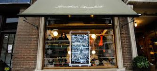
OUGD503 - John Lewis - Window Display
Our window display
With time running out our order of a plastic acrylic sheet didn't come which we ordered a week before the deadline. We came up with the idea of going to the print room and using acetate paper to put across it so that we could put up our illustrations and designs on the front. I went down and visited woodwork within uni and asked to create me a wooden version of the maquette that I had created earlier. I printed out all the elements of the display that would be pieced together in the print room. All of us were present during the actual piecing together of the display - Nathan and myself went and got it created in the woodwork, and printed out all the resources to used it for the display. I was over the moon with the final outcome. It felt like it was John Lewis and I felt like we did a good job considering our acrylic didn't come on the date we ordered it.

A maquette I made myself so that the wood department would have a general knowledge of what I wanted to create.

The Final wooden piece created in the wood department in university.

Our final model of our interactive window display. I personally really liked the final outcome and was pleased to have something physical for this brief.

I really think the illustrations shone through this model. It made the model itself feel more homely and more like something that John Lewis would create themselves.
OUGD503 - John Lewis - Further Development
Throughout the whole project me and Nathan have been working very closely on each design. Collectively we have spent a lot of time after university working together on each design and giving feedback sessions. We even invited the Illustrators to come over to Nathan's to collectively see our designs and see how we can help each other to further these designs.
First Draft:


First Draft:


Second Draft:

Nathan created the majority of these posters whilst I was there next to him collectively putting ideas together to create these designs. Although Nathan was behind the laptop at this design I think we both collectively put in the ideas to create these posters; helping each other lay out the page and constantly giving feedback to each other. Personally these posters feel more simple however, I do like the first drafts as they incorporate the illustrators work within the work which makes it feel more personal and homely.
FINAL POSTERS:


Monday, 4 April 2016
OUGD503 - John Lewis - Further development


I tried to create a poster that would invite you into the John Lewis store. I took away the writing and made the triangles a lot smaller (left). I also tried to make the triangle bigger to see if it looked more aesthetic. I however prefer the design on the left as it gives the items more depth and directs it towards the items and the illustrations. I've also mixed around the colours with the other designs as orange blended too much with the fox and this way the fox and the laptop are more visible with a more subtle green triangle.

In this design I have removed the text and taken a lot of the illustrations out to again match the designs above and keep it more inviting and more like a set of series.
OUGD503 - John Lewis - Initial Ideas
 I started by getting given the illustrators initial work. I really liked the simplicity of uniting their illustrations with our concept. I used these illustrations to create a series of posters. The illustrations are quite child like but I think this would reach a wider market as we saw with the John Lewis advert using cardboard cut outs in 2013. The brief asks us specifically to relate back to John Lewis whilst almost making it seem as if it wasn't John Lewis. This can be heard from Soundcloud which was provided by the brief set by D&AD. https://soundcloud.com/d-ad/new-blood-awards-2016-john-lewis-interview
The concept of our first draft was using shapes but especially triangles as it gives depth towards the posters. I was given the furniture chosen by the illustrators and told to create a poster. The concept behind my posters was to use illustrations from the illustrators to encourage a homely feel. For example the first poster shows off a sofa (taken from John Lewis).It uses everyday house objects such as animals (cat) and furniture (painting) to make the posters look illustrative but still linking back to reality. I personally liked the posters more without the price of the sofas as it made more inviting towards the store. The reason behind the prices is that this is meant to show off a range of sofa's which would be changing on an interactive board. I really wanted to push for an interactive poster because it would make you stop and watch the video. It would also show off the range of products which is the basics of our concept.


Sunday, 3 April 2016
OUGD503 - John Lewis - Basic idea development
We came together and create a basic triangle system that everyone could work from. The designs are easier to understand and are a lot simplistic. This will be the basis of the animation backdrop as well as using these triangles in our posters.


We collectively chose the colours and items to match each triangle.


Saturday, 2 April 2016
OUGD503 - John Lewis - NEW Concept
Me and Nathan had presented our previous concept to Simon Harrison who addressed concerns for our idea. We previously spoke about this between me and Nathan and thought that the concept needed development. It felt like it wasn't serious enough for John Lewis. We then decided to come together and take another look at the brief and our options as a group. This stage was personally very hard for ourselves as we had a lot of disputes as to what to do. However, after this phase we really got working well together and I couldn't have been more happier.
CREDIT TO BILLIE FRANCIS (We collectively spoke about the changes together)
Because our first concept wasn't successful in the end, we meet up and had a team talk. We looked over research we had already made and the brief and tried to think of new ideas. Looking at Maddie's shop window research these images took our interest.


What I liked about these what the simplicity of it and how it use it colour. I thought it was a good way of highlight products in a simple but interesting. I like that play on the light beam and light. This then sparked my idea of the concept. I thought that the window display could simply be 3 light beams with 3 products. Then the interactive bit would then be a sensor and a hologram. When you walk up to the widow the señor would be triggered and a hologram of other products would then appear around the products.
This concept addressed problems we discussed about John Lewis itself. Having 3 products showcasing 3 different areas of the store addressed what John Lewis personally wanted us to look at in the brief. Therefore we had a section for home, electrical and fashion. Also when thinking of John Lewis people tend to get overwhelmed with the products, so having a select few would address what can actually be brought there. Also when thinking of John Lewis, it can be perceived to have a more luxury front and people perceive it to be really expensive. But actually there are some affordable products at John Lewis. So by showing a range of products showing a range of prices addresses this problem. Also when thinking of clothes at John Lewis people don't really know the designers there and isn't seen as being trendy. We have the opportunity to show consumers that John Lewis does sell fashionable clothes, appealing to a variety of audiences. To relate to autumn the products that we pick will be autumnal. The beams of light will be all different colours but colours to represent the season. We still want to add an illustrative element to the design attracting more people, making it look more inviting and playful. When the other products appear we are going to include some illustrations that appear along side.
This is a much more minimalist approach to the brief. We have sat down, analysed the brief and analysed the weaknesses of John Lewis. I think this way approach has been much more successful and we calmly and effectively come up with a strong concept. I think keeping is simple has made it really effective as its clear what we are trying to communicate. This concept also gives John Lewis a clean modern look. They are normally quite clean and sleek but I think we have pushed it further with the interactive element and being minimal in the design.


Thursday, 31 March 2016
OUGD503 - John Lewis - OLD Concept -
After initial research, we came together briefly as a group and came up with a concept. However this first meeting was very short and brief and not all ideas were covered. During this meeting we reflected on John lewis's campaign qualities. Although we aren't making a campaign and are making a window design, it was interesting to see what was already a success for the brand. We admired their ability to communicate through narrative and wanted to reflect this within our window display. Following this and looking over research we had done separately, we liked how Maddie had looked at fairytales and children's book narrative. Due to it being a autumn window we thought a forest scene would be appropriate, playing on the story of Little Red Riding Hood. Developing on from this narrative we want to display a forest scene full of characters like a wolf, a little girl and others to be displayed showing using John Lewis products. Do this idea have a narrative though? Will consumers be able to know whats going on? Will they have a emotional connection to it? Or is it just a display of animals in a forest using products?
Also we thought of another aspect which could be expand the window display. Billie and Maddie came up with the idea of having paper origami handouts. These handouts would be postcards and put into peoples bags when they would buy something in store. This would be a template of a mini woodland house which costumers would be able to build at home. This could also expand to an online campaign as a hashtag could be made, making people post their results online to Twitter and Instagram.
PROS
- Range of products used in the display - showing John Lewis' range and quality of products.
- Lots of detail, the window is engaging to look at
- New image for John Lewis? Quite a illustrative approach which is different to their clean and simple design.
- Narrative element - makes the window display more relatable
CONS
- Too childish? Different form their sophisticated look
- The concept isn't strong enough - May look nice but the narrative aspect could get lost and may just look like a forest display not making it relatable to John Lewis
- The window is insight to the store - Only have a few seconds to look at the display whilst looking past. Is there too much too look at?
Reflecting on our concept to me it doesn't feel that strong. I think one of the problems is that we all actually need to come together as one group and discuss these ideas more. Because this has been based on two members of the group, it is hard to see what is working and isn't working. Critical feedback from all group members is needed. Also with this concept us graphic designers would feel we don't have much part in the production.
I think we all need to have a big discussion about what works and doesn't work. In my opinion this concept does need to be developing.
OUGD503 - John Lewis - Collaborative Research
The research for this brief was conducted as a group effort - and both interactive and non interactive areas were researched prior to any design choices being made, or definitive idea being made as to what we were going to create ourselves.
CREDIT:
Nathan Laville
Billie Francis
Madeleine-Richardson
Daniel Carter
The Window That Never Sleeps
This window display concept was developed By Carl Bresnahan for Paul Smith to attract costumers through technology. He composed a holographic interactive window display for the Paul Smith store on Floral Street, Covent Garden, London. This window display is very eye catching for the consumer. Even if it doesn't draw in consumers, it makes people interested making people interested in the brand. The holographic bodiless men in suits displays Paul Smiths clothes. Not only is it eye catching but it cleverly promotes their clothes and is a much better way of just having manikins. The interactive part is really interesting as people can interact with it outside the window. People can walk up to the window and select what suit they would like to see, then the holograph would do a certain action. The window can be interacted with all day and all night, which suggests a 'window that never sleeps'.

Topshop: Oxford Street - LFW
'TOPSHOP collaborated with technology agency, Inition, to create a virtual reality window display for London Fashion Week AW14. Sitting down in the virtual reality ‘TOPSHOP Unique’ window you can have a front row seat at the Fashion show with the virtual reality headsets and headphone.'
This is a really interesting concept as it makes the passerby part of the actual window display. As well as it being interactive, The window display isn't complete without the participation of the consumer.

CREDIT:
Nathan Laville
Billie Francis
Madeleine-Richardson
Daniel Carter
The Window That Never Sleeps
This window display concept was developed By Carl Bresnahan for Paul Smith to attract costumers through technology. He composed a holographic interactive window display for the Paul Smith store on Floral Street, Covent Garden, London. This window display is very eye catching for the consumer. Even if it doesn't draw in consumers, it makes people interested making people interested in the brand. The holographic bodiless men in suits displays Paul Smiths clothes. Not only is it eye catching but it cleverly promotes their clothes and is a much better way of just having manikins. The interactive part is really interesting as people can interact with it outside the window. People can walk up to the window and select what suit they would like to see, then the holograph would do a certain action. The window can be interacted with all day and all night, which suggests a 'window that never sleeps'.

Knit: Facial Recognition
Knit had a interact window display for one of there stores where they had a huge LED screen with snow falling down it. Passers by would then look into the 'mirror' screen and have their photo taken. Then they had to text a number to get a 4 digit code to see their picture which they could then post to Facebook. Whats good about this is that it has a social media element as well as a interactive element. I think that we could adapt and push this idea. When your face appears in the mirror a funny filter of you dressed as the wolf could pop up. This photo would then be posted to social media making a social interaction.

By researching it looks like a lot of touch screen window displays have already been done so it would be better to probably avoid a touch screen aspect. Or develop on from touchscreen and have a different aspect to it as well.
Nokia Lumia
Nokia had a window display at Oxford Street Selfridges promoting their latest window phone. The theme for the Selfridges window was 'enchainment' so they window display was an enchanted forest. There was a social media aspect where passersby are encouraged to tweet #switch @nokia_UK to start a mini light show sequence in the window. This is a really good way of using social media as an interaction, its a simple concept but really effective.
Topshop: Oxford Street - LFW
'TOPSHOP collaborated with technology agency, Inition, to create a virtual reality window display for London Fashion Week AW14. Sitting down in the virtual reality ‘TOPSHOP Unique’ window you can have a front row seat at the Fashion show with the virtual reality headsets and headphone.'
This is a really interesting concept as it makes the passerby part of the actual window display. As well as it being interactive, The window display isn't complete without the participation of the consumer.

Wednesday, 30 March 2016
OUGD503 - John Lewis - Research
Credit:
http://b-francis1417-sp.blogspot.co.uk/2016/03/john-lewis-window-research-in-leeds.html?m=1


http://b-francis1417-sp.blogspot.co.uk/2016/03/john-lewis-window-research-in-leeds.html?m=1


Billie and Maddie took a trip into the centre of Leeds to do some visual research and look at what window displays are like in the shops around us. No window displays that they came across were interactive, but there were a few nice windows. This is good as it shows the products so instantly the consumer can see what they can buy. Although the way some of the shops displayed it wasn't very interesting. The size display caught me eye. The illustrative aspect makes it look more visually appealing. The store didn't display their trainers in order to invite you in and used some visuals instead.
Tuesday, 29 March 2016
OUGD503 - John Lewis - Group Proposal
After losing my group proposal form I have decided to rewrite it myself.
Name: Daniel Carter
Brief Title: John Lewis: Create a window into the brand.
What are you looking for in a creative partner? What are your aims?
Name: Daniel Carter
Brief Title: John Lewis: Create a window into the brand.
What are you looking for in a creative partner? What are your aims?
- I'm looking for someone who can benefit from my designs as well as benefiting from others who have different roles who could teach me something. I want a team that is harding and relies on each other rather than on one person. I want everyone to be driven by this brief and to learn new things about each other as well learning new techniques and skills.
- My personal aims are to learn new techniques/things from my new members. I intend to contribute as much as everyone else in the group.
What are your specific areas of creative interest?
- Graphic design. - Posters, Logo, Typography, Grid, Layout.
- New programs
- 3D Design
What specific creative skills do you have to offer in relation to a creative partnership? How do you intend to use them?
- I believe I am good at positioning text and layout. I have a creative mind so I intend to bombard my group with ideas that could potentially build into something. I love working in a team more than I do individually as it is a time to bounce ideas from each other and learn from each other.
What Specific non creative skills do you have to offer in relation to a creative partnership? How do you intend to use them?
- I believe I am getting better at organisation and see myself as a team leader. I am very open to suggestions and would say I can take information from everyone and put it all together so that no one has a disagreement and everyone stays on the same page. I am very motivated and enthusiastic about working in a team.
What do you see your specific roles be in the collaboration?
- I intend to work collaboratively with Nathan Laville and use everything we have learn in the past two years. I intend to help design the window display as well as creating anything graphic for the team posters etc etc. I intend to keep everyone happy in the group so that no disagreements can alter how we work as a collective.
What will your individual responsibilities be in the collaboration?
- I'm sure the group chosen will share each responsibility fairly. I intend to do research, poster design and 3D making.
What will your joint responsibilities be? How will you deal with your project costs and budget?
- We have agreed to split everything fairly between us so any cost and budget will be discussed at the end. We have all agreed to not shy away with money if we are in need to buy something that could benefit our brief.
Monday, 28 March 2016
OUGD503 - John Lewis - Further Research
As a collective we all agreed to do some research together. However, before we got together it was important to have knowledge of what we were going to do therefore I decided to do some research myself to show towards the group.
The Hiut Denim Co.
https://www.youtube.com/watch?v=3tZFBwhqqXM
The following link shows 'The Hiut Denim Co' design an interactive window that used touch to inform people of their shops history and many more. I really like the simplicity of someone coming up to the store and pressing their hand on a window and finding out more about the store. When you go into a shop you don't really know the past and present of the store and some people like myself like to know more about a shop when you walk into it.


From this video I have learnt that we need to create something that could take technology further in its development. We as a group need to think of a way that will benefit John Lewis like no other store and make sure that John Lewis is the first brand to show it. From this video I think creating something with holograms would be something new and something that I have never seen myself.

 Liberty London.
I like that this window display doesn't show of all the stores products but instead has left a quote with a QR scan that makes you interact by getting your phone and scanning the code to see whats inside. This is an idea that we originally thought we should take forward as it opens up a 'surprise factor' once you have scanned in the code. In this store it opened up to be a game which was meant to entertain the customers.
"The longer you can keep a customer engaged in interactive displays, the more invested in your store they will feel."

The Hiut Denim Co.
https://www.youtube.com/watch?v=3tZFBwhqqXM
The following link shows 'The Hiut Denim Co' design an interactive window that used touch to inform people of their shops history and many more. I really like the simplicity of someone coming up to the store and pressing their hand on a window and finding out more about the store. When you go into a shop you don't really know the past and present of the store and some people like myself like to know more about a shop when you walk into it.


From this video I have learnt that we need to create something that could take technology further in its development. We as a group need to think of a way that will benefit John Lewis like no other store and make sure that John Lewis is the first brand to show it. From this video I think creating something with holograms would be something new and something that I have never seen myself.

Nike.
This window display would interact when someone walked past the window. The balls would rise wherever the person was below it. The design aesthetic is simple and helps you interact with the audience before they enter the shop. Nike is renown for interacting with people whilst having the slogan 'Just do it' which makes you litterally want to 'Just do it'. The Interactive 'displays' draws your attention and makes you stop and think. This is something that my group and I would like to take further and create something that will interact with you and make you stop and think.

I like that this window display doesn't show of all the stores products but instead has left a quote with a QR scan that makes you interact by getting your phone and scanning the code to see whats inside. This is an idea that we originally thought we should take forward as it opens up a 'surprise factor' once you have scanned in the code. In this store it opened up to be a game which was meant to entertain the customers.
"The longer you can keep a customer engaged in interactive displays, the more invested in your store they will feel."

Tommy Hilfiger.
Another store that has introduced interactive windows using touch. Here we see a gentleman using an interactive board to sign up to what I presume is a mail list. This means the person using it is engaging with the brand and that is what you want to see as a consumer brand. This makes you feel that you can rely on that brand and leave them your details so that they can send you new promotion and updates.
Subscribe to:
Comments (Atom)