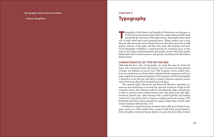
Here is a page layout that I found that on google images that drew my attention because I like the use of colour on one page and how the text is all aligned and how it has a small quote on the left hand side that makes you want to find out what that quote is. I think this book is very smart because its easily legible and is eye catching.
This is another page spread that I found interesting because of the use of black and white and how the page is spread into paragraphs that makes it more readable and makes you want to find out about these two people. I also like the black and white contrast.
I think that this image is the most original and unique page. This is because of the way that the page has been layed out and how it is all aligned in columns of 2 for the first page and in columnbs of 3 in the second page. I like the use of vibrant images that stand out and the use of cut images to almost point towards the title.


No comments:
Post a Comment