I was very satisfied with my book because I was given a week to create this book and believe I could achieve a lot more if I was given a week extra. I think the book is simplistic and I think the page layout works as a whole because it educates you and I believe is quite formal but centres its attention towards the photography.

I wanted my front cover to not have a title and to have just one photograph of the images that were taken by my classmates. The reason why I used this background colour is because the images that were not developed consisted of a colour roughly like this one. I didn't want a black background because I thought it was too harsh on the eyes and wouldn't let the developed photos stand out.

I wanted to create a contents page because it is quite formal and has a lot of information inside.
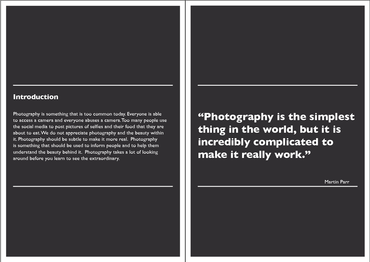
I wanted give an introduction as to how I feel photography is used whilst quoting a similar view to me on the right.

I wanted to place all my facts onto one page and I didn't include all the facts because some of them weren't as interesting as the ones I chose.


I thought that having an opinion is very important and decided to do a double page spread because a lot of the answers that were given were all very different and all very valid and this is what I wanted to show throughout my book.

I think statistics are important and should be shown because they are facts and most of these statistics point out how we overuse the camera on our phones and how little of them are actually worth keeping. I also wanted to show how much of an involvement social medias have today.

I think it is important to voice the opinion of what people consider photography.

The back page is of photos that I see as having taken time to produce and create an irony between the front page which is what I am aiming to show.
No comments:
Post a Comment