Wednesday 14 December 2016

OUGD603 - Blood Brother - Final outcome

Here is my final design that I have created using photoshop. From the development there was a lot more towards the bottom, Blood Brother decided that it was too heavy image and too complex for Blood Brothers style. Although, they did like the top half of my design that we made little changes towards and then Blood Brother launched it live. 


Personally, I am over the moon to have had my design on a global fashion market website - Blood Brother. I believe once I go back to Blood Brother I will get  a chance to improve the website further as it is something that I would enjoy producing. 
The website is now live on Bloodbrother.co.uk. Owner Nicholas Biela can confirm this. 

Monday 12 December 2016

OUGD603 - Blood Brother - Development

After creating wireframes and developed website pages, I decided to go back and make it more interactive. 


Sunday 11 December 2016

OUGD603 - Blood Brother - EXTRA

Although some of this work was started during the internship, most of these designs have been continued and finished and sent back to Blood Brother. 


Wednesday 7 December 2016

OUGD603 - Blood Brother - Development


Working with the research and the website frames, I have decided to create a website that is more welcoming, energetic and interactive. I was able to gain some access to Blood Brother HQ images and used these within the website designs. 
Web design is the most common term used for professionals in this industry. Oftentimes, when someone says they are a "web designer" that are referring to a very broad set of skills, one of which is visual design.

The "design" part of this equation deals with the customer-facing or "front end" part of the website. A web designer is concerned with how a site looks and how the customers interact with it.

Web development on the other hand comes in two flavors - front-end development and back-end development.Some of the skills in these two flavor overlap, but they do have very different purposes in the web design profession.A front-end developer takes the visual design of a website.

Here is the development as a visual design with no coding. 

Sunday 4 December 2016

OUGD603 - Blood Brother - Initial Ideas

Here are wireframes that I have put together to create the foundation for building the website together. 
I have kept it minimal and within Blood Brothers style. 


Friday 2 December 2016

OUGD603 - Blood Brother - Research

Whilst being at the internship, I was told to always stick to the clients need and style. 
To have an understanding of Blood Brothers style, I looked into their website. It it very simplified and easy to use although it lacks warmth. It’s a website that is easy to use but doesn’t really want you to come back. Feeling a bit empty and lost. 

What works best is the colour match throughout each page. Each page has a white background with images what almost seem randomly layed out. The blogs are pages that I would especially see into changing as they look like they have been produced on microsoft word. which looks unprofessional and not welcoming.  


Looking at different competitor websites is essential to making sure you’re up to trend with style of others around. Being a graphic designer we pick certain elements that work and take out those that don’t work. This is the same in fashion design where designers inspire from their competitors to make themselves better. 
Looking at icons that could help portray social media. Fashion and Blood Brother capitalise on social media as they are used more than billboards. Today social media is exploding and being aware of it is important to expand in business. 

Here I have looked at competitors and ‘certain elements’ that I would like to use within my designs. 

Thursday 1 December 2016

OUGD603 - Blood Brother - Brief

To create a website that consists of similar styles and aesthetics as Blood Brother. Remember to keep to the original style but add your own style.  
Background
Blood Brother are looking to create a new website launch. Using new updated photography I am to create a website that is going to be original. 
Deliverables
- Design the website

CONCEPT FOR THE BRIEF

Blood Brother have a very minimalistic style and very urban, edgy style. It it about matching the style and fashion of Blood Brother and making  sure they are ahead of competitors. 

Wednesday 18 May 2016

OUGD505 - Studio Brief 02 - Design Boards

OUGD505 - Studio Brief 01 - Design Boards

OUGD505 - Module Evaluation

The module OUGD505 was one that I really enjoyed and one that I learnt the most from. This module was basically preparing yourself for level 6. The briefs were more self-directed. Studio brief 01 gave us the freedom to create our own banknotes that could relate to anything that we research. Studio brief 02 on the other hand, was much more informative and more about researching. This module has taught me a lot more about how and what I need to research when looking into something new. Personally, this brief I did a lot more research than I would in any other module as I had to research and link everything together so that it wasn’t made without a purpose. As I progress into level 6 I believe my body of work is getting larger and I am enjoying coming into university and studying.

What I enjoyed most about this brief is that everything was very self-directed. Studio brief 01 I decided to create banknotes for gender equality but targeting women who live in countries that do not agree with women equality. This led me to research into countries that do not support women equality such as United Arab Emirates. I also found out that the UAE is an Islamic country therefore, I decided to visit the British Museum and go into the Islamic world to get further research. I then used the patterns I found in the museum to influence my own designs. I also managed to research henna and make that the feminine touch to my banknotes. To conclude, I think studio brief 01 was very enjoyable and I found screen printing a lot more relaxing than last time.
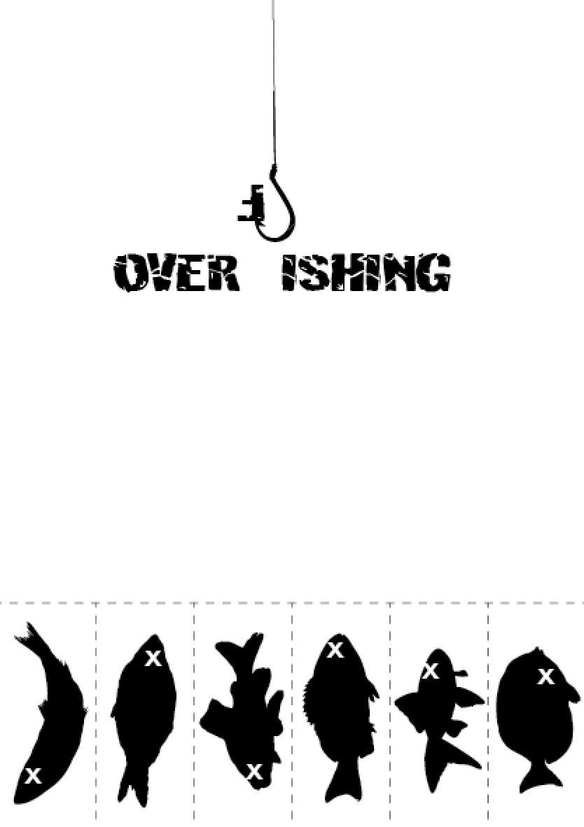
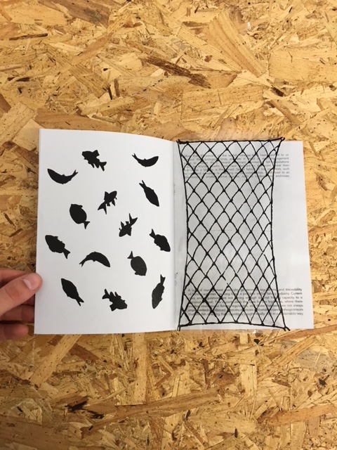
            Studio Brief 02 on the other hand, was very research heavy. Fishing is something that I am very passionate about and when working in a group exercise I wanted to learn and campaign more overfishing. This way I would be more ambitious to learn a new topic of interest and put it towards my research and development. I also wanted to give myself a challenge. I wanted to take something that is not globally recognised and then campaign for it to see how far I could potentially take it. Overfishing was something that I very much enjoyed researching and learning from. I also liked that I put my own twist on the campaign by making it more expressive and monochrome to try to reach out to a further target audience as well as making people want to stop and think about my posters and designs. The theme of the campaign was to keep it as simple as possible and to make it interactive and expressive within my designs.

I think I learnt a lot about researching and using that research to influence your designs. In previous modules, I didn’t think as much as I did for these briefs. All my designs were linked to my research and I even learnt a new technique of laser cutting. For one of my posters in studio brief 02, I was advised to use the laser cutting machine to save time and to make it more precise. In the future, I hope to use more printing methods like I have in these two briefs. I have used both screen printing and laser cutting to experiment more with my work and to not stay so much digital within my own work.

To conclude, I was very satisfied with my final outcomes and how they came out for both studio brief 01 and 02. Although I think my outcomes are normally quite strong I feel as it I have done a lot more research than I have in the past and I have actually enjoyed researching this time. As level 5 comes to an end, I believe I am ready to progress into the third year as I have learnt a lot throughout the year especially researching, experimenting, developing and making sure my final outcomes are linked with my research. I am very satisfied with my final outcomes for these two briefs and believe they have matched the brief that I have set them myself. I hope to continue getting better and stronger as I progress into the final year.


Tuesday 17 May 2016

OUGD505 - Studio Brief 02 - Printing considerations

Final booklet publication: 
The paper that I bought for my final booklet publication was an A1 Colourplan of 135gsm with the colour choice being 'cool blue'.
Reasoning: I decided to use a very subtle 'cool blue' colour that wasn't too vibrant and matched my expressive campaign. The cool blue colour was to match the idea of the booklet being about waters and fish to which we can relate to as the colour of the sea which is blue. However, I didn't want a vibrant blue as it would take away from the simplicity of the publication which focuses on illustrations and information to inform you where you can help. 

Final set of three posters: 
Throughout all 3 posters the paper used was matt 235 gsm. I also used acetate paper to support one of the posters. 
I decided to use white matt paper as it was the right thickness for a campaign poster. I used see-through acetate paper because it was transparent and therefore created the image of fish being caught by the net. I had illustrations of fish on my booklet and wanted to create a vision of those fish being caught out by a net. This would illustrate ways that the fish are caught (line) as well as showing how many of those fish are actually caught. 

Using laser cutting for one of the posters:
For one of the poster I decided to laser cut the fish so that they would give the impression of the fish being hung by a fish hook. I decided to laser cut the illustrations of fish to save myself time instead of cutting each fish individually and making a human error. After being taught how to use the laser cutting machine it would make my campaign posters more efficient as more of the posters could be created at a shorter time therefore placing them around Leeds to encourage students and adults to campaign towards overfishing. 

Thoughts for improvement:
In the future I would adapt my overfishing logo so that the logo could also look like it was hanging my fish hooks which would relate back to overfishing and making the logo more interactive. As I sent my designs to the laser cutting machine I noticed that all 3 of my posters created could be cut at a large scale and put around Leeds and other cities to bring awareness to the campaign. 

Monday 16 May 2016

OUGD505 - Studio Brief 02 - Final poster outcomes

Within this poster I have tried to create tabs of fish which can be pulled out. The idea behind is that it shows once the fish are pulled out you can not replace them as easily. It could also been seen that once the fish are taken off it would be used as a promotion towards the logo and the campaign. By having just a poster with the logo on it makes the viewer curious as to what overfishing is. This is where the website would be most suitable as it links with my own personal website informing viewers about the dangers of overfishing. 

For this poster I decided to create two overlays. I created the first overlay (left) with matt paper with simple illustrations of fish to show the freedom of fish. The second overlay is created using acetate paper. It is a transparent image of a net that links back with my research 'more than 85% of the world fisheries have been pushed to their biological limits and now something needs to be done before it is too late'. On the final produced poster (right) you can see how there are a few fish who have managed to escape. However, it is the image of the fish being caught by the net that makes it expressive and eye catching. I believe this poster works very well as it shows the main way that fish are being caught in the seas. I also like how the fish are trapped under the net of the acetate paper.

This is the poster that I decided to laser cut. At first I wasn't very aware of how quick laser cutting takes and how efficient it could be if I wanted to create more posters to raise awareness. The poster itself shows fish on a hook that have been cut out by the laser. Once they are cut you take out the outline of the fish and let them hang off the poster. I wanted this poster to be the most aggressive as well as the most expressive with the idea of fish being hung by fish hooks. This way the viewer sees both the fish being caught on the paper as well as off paper showing how many fish are caught in the ocean. "In the past 50 years unsustainable fishes are being pushed to the point where they can not replace them through natural reproduction."

Saturday 14 May 2016

OUGD505 - Studio Brief 02 - Final website outcome on Issue

After having some problems with the files I decided to upload my website onto Issue. 


OUGD505 - Studio Brief 02 - Website Outcome

Here is my final website design that I created for Overfishing.org. As I started researching about overfishing I noticed a website that was very poorly structured and had nothing fun about it that wanted to make me continue reading it. Therefore, I created my own design for the website that would hopefully encourage people to enter the website and learn more about overfishing.  I wanted my website to be a continuous scroll down website however, the JPG file was too big to upload to blogger. 

I wanted to create a website for my campaign because we live in a digital world where everyone is being brought up with technology. When I started researching at the start of this project I wasn't aware of what overfishing was until I started searching around various websites. This website gives you all the right information and makes you understand about overfishing and its causes. Throughout my campaign, I wanted my posters, website and publication to be interactive and expressive. I wanted people to take an interest in overfishing and take it a bit more serious. Overfishing is something that a lot of people are aware about overfishing however, choose to ignore it. I wanted this website to be informative but still sticking with the theme of the campaign; interactive and expressive.  


Friday 13 May 2016

OUGD505 - Studio Brief 02 - Overfishing publication

The front cover of the book. 
I wanted to keep the information booklet short and informative. As I have with my poster I wanted my booklet to be interactive and easy to understand. I decided to use the logo that I created for this campaign as it was simple to understand and made you aware of what the book is about. 


The middle of the book I decided to use acetate paper mixed with paper that I bought in Fred Aldous. 

Here you see two images where I have used illustrations on the main booklet showing fish. In the other image you see how the use of acetate paper has made the booklet more interactive by showing the fish being caught by the net. On the acetate paper on the other side of the net there is more information that links with the cool blue paper. 


The back cover. A simple back cover with the website link on the bottom right. There are also numerous of other groups that support overfishing and they are mentioned in the middle of the back page.