Whilst being at the internship, I was told to always stick to the clients need and style.
To have an understanding of Blood Brothers style, I looked into their website. It it very simplified and easy to use although it lacks warmth. It’s a website that is easy to use but doesn’t really want you to come back. Feeling a bit empty and lost.
What works best is the colour match throughout each page. Each page has a white background with images what almost seem randomly layed out. The blogs are pages that I would especially see into changing as they look like they have been produced on microsoft word. which looks unprofessional and not welcoming.
Looking at different competitor websites is essential to making sure you’re up to trend with style of others around. Being a graphic designer we pick certain elements that work and take out those that don’t work. This is the same in fashion design where designers inspire from their competitors to make themselves better.
Looking at icons that could help portray social media. Fashion and Blood Brother capitalise on social media as they are used more than billboards. Today social media is exploding and being aware of it is important to expand in business.
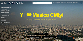
Here I have looked at competitors and ‘certain elements’ that I would like to use within my designs.


No comments:
Post a Comment