OUGD503 - Emil and The Detective - Research
Research is very important when coming to design a children' book. It is important to not forget that you are designing for a child. What you design has to be clever and easy for a child to understand. After going to a local library I had a look at a few books and chose books that were either; the same colour choice as Emil and the Detective, had a similar target audience or made me want to pick it up.
I find it important to look back at previous designs that have been created on the same book that I have created.
A simplistic design showing the streets, to what I can presume is Berlin. It's important for the reader to know what scene it is set as it could affect the story behind. I admire the illustrations behind this book cover. In the brief it says it is important for the front cover to work on its own and in this situation I believe it has. It consists of a man walking away with a bowler hat whilst two boys behind pillars are watching his moves. They are aware that a man with a bowler hat had taken their money and they are now in search of this man who is illustrated in green. The typeface chosen is playful and 'detective' like. I like the simplicity of the front cover as well as the colour choice.

This is a front cover that I myself am not too fond off. It doesn't really explain the plot of the story. The yellow colour chosen here doesn't blend well with the grotesque colour of the word Emil. This doesn't seem much like a children's book and doesn't have that element of fun in it. When you pick up a children's book you want something that is going to be eye catching and imaginative for a child to pick up.

Again, this front cover is quite dull and uses a variety of colours. The front cover feels quite dated and although it has identical illustrations it almost feels as if they are two different children's books. I myself am a fan of monochrome colours but in this cover they look dull and quite intimidating for a child. In my opinions children's books need to have colour. It's what children desire when they are younger. When I was younger I would love to take different colours and colour them in the most vibrant colours. The words Emil and Detectives are two different colours and questions me whether Emil is a detective or not. The typeface is also very serious with a slab serif format which again in my opinion shouldn't exist with a children's book.

This is a book cover that I have used for my inspiration. It tells you the plot of Emil and his friend detectives looking for this man who reminds me of an old cartoon Inspector Gadget who was also a detective in the 2000's. Here we see children hiding and looking around the word Emil as if they have already began their detective story. The children are also looking at this man as if they are suspicious. This cover to me explains the plot of the book very well and is well illustrated clearly showing who are the good and bad guys in the book.
I also think it is important to almost paint an image of how the 'bad' guy might look throughout the book. It gives the children reading some imagination and thought as they read the book.
Again, in my opinion a cover that hasn't worked. The book around is using a vibrant yellow whilst the image of the detective and the children are done in monochrome. This makes me feel as if the book is dated and doesn't explain the story well.
I decided to visit a local library to see some books that caught my attention and why they might have caught my attention. Here are a few of my results.
 Back cover.
Simple and easy to read. I'm not too sure about the pyramid writing and the meaning behind that ...
The simplicity of the bird made me want to pick this book up. I also really liked the choice of yellow as it was vibrant and stood out to me when I walked in. I don't like to overcomplicate designs because it then confuses the reader. This book has a very simplistic layout with legible writing. I would only question why the writing is written in a pyramid shape leaving orphans and widows. The title and author is very bold and I think its important to have it bold and easily recognisable. I personally believe that illustrators and designers should be mentioned on most book designs as we can get very little credit for making a book stand out and making you want to buy it.
Back cover.
Simple and easy to read. I'm not too sure about the pyramid writing and the meaning behind that ...
The simplicity of the bird made me want to pick this book up. I also really liked the choice of yellow as it was vibrant and stood out to me when I walked in. I don't like to overcomplicate designs because it then confuses the reader. This book has a very simplistic layout with legible writing. I would only question why the writing is written in a pyramid shape leaving orphans and widows. The title and author is very bold and I think its important to have it bold and easily recognisable. I personally believe that illustrators and designers should be mentioned on most book designs as we can get very little credit for making a book stand out and making you want to buy it.

 This is a book that could even work for Emil and the Detective. You can instantly tell from the basics of the book that it is about a thief/detective. I also like the simplicity of black working on white. It keeps it minimalistic and iconic. It is a penguin book so I will keep in mind the idea of having my book done professionally whilst keeping it simple and recognisable.
The back cover is very different to the front cover. I question why the change of colour when black on white works very well on the front cover. I would personally have kept it consistent as it feels as if i've picked up two different books. The writing isn't legible and is quite hard to read. I am dyslexic and reading that plot wasn't easy on the eye. I don't really understand why the back is orange with black writing as well as keeping the writing fairly small in the top right hand side corner.
Although the colour attracted me to the book I think the illustrations are very simple and again, easy to read. I also like the print chosen on the writing 'Bret Easton Ellis'. The writing was made in gloss and as a designer it made me want to buy the book. The only think I would question would be why the child in the illustration has writing over his eyes. I don't think it does the information on it very well.
The back cover I have mixed feeling about. I'm glad the colour was consistent throughout the book, it makes the book look neat and more valuable. The orange words are meant to be recognisable and easily noticeable. On the other hand blue reminds me of the NHS and an illustration on the back would have made this book cover more appealing. However, I like the simplicity of the book.
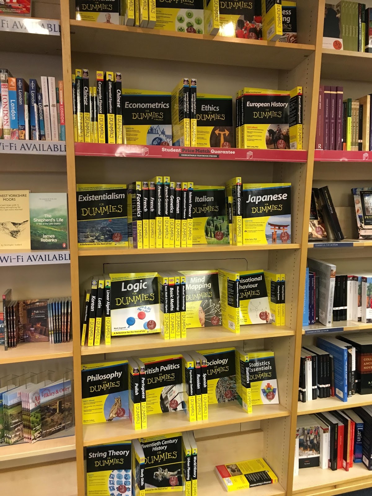
Although there are all books for dummies this is one book stand that made me want to go towards it. For my Emil and the Detective book I intend to keep the book cover the same colour as the other Emil book with the children leaning on the wall.


 Back cover.


No comments:
Post a Comment