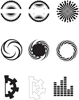
From my research, I have decided create my own illusions as best as I could. I have also left spaces within the designs so that I could place the artists band’s name within. I wanted to keep the optical illusions round as it represents the globe that they intend to travel around. I have also taken inspiration from my research about the artists. Using the image with the lights (research page) I wanted to recreate something similar (development 1)(Top right illusion) working from a distance to eventually come in the middle and make it look more like an optical illusion. I also wanted the design to feel more welcoming therefore starting from the middle which is a dot to then expand.
Development 2 is about using music bars and their personalities to try create something unique for their logo. I started playing around with the music bars/equalizers. Their favourite design was the top right design as it reminded them of music bars being used as a representation of the globe. I also wanted to create the spanish flag within the design however, I really struggled with the bar lines. Instead I have placed their band name in the middle (typeface is still subject to change). The last 3 designs on the bottom of the page are an afro and a hat as these are two personal traits that Kyle and Danny use when they are on stage.
Development 3 is playing around witht he word Distant but only using text and maybe a small illustration. I wanted to keep it simple therefore I didn’t want to play around with illustrations too much but focus purely on the word Distant. This is my favourite development page out of the 3 because it uses text only and you have to be more creative whilst being subtle.


No comments:
Post a Comment