Monday 23 January 2017

OUGD603 - Distant album cover - Final outcome

Final album cover 
Here are the final designs of the album covers designed for Distants new upcoming album US.

The final design consists of the letter i worked in with the album name ‘us’. This is to represent Distants story of how they first started as individuals and came together to create distant. Distant being two men from a ‘Distant’ country Spain coming to the UK to pursue their dreams and ambitions. 


Final outcomes of the CD album covers. 


Saturday 21 January 2017

OUGD603 - Distant album cover - Development

Making the cover
Using crayon oils use within the development stage to further create designs for the front and back of the album cover.
I will give credit to Paayal Makdani who helped me come up with our idea; 

Distant have both been working seperataly in Leeds (Kyle Rolph) and London (Danny Bristow)  this is represented in the  i (individual) in us. The us represents them being united through their music and ‘US’(Danny and Kyle-Distant).  


Friday 20 January 2017

OUGD603 - Distant album cover - Development

Making an iconic name 
Using spray paints and crayon oils to create developments used within designs as shown on the right. 

Starting with 5 developed ideas, ready to give to the client a choice of preference. 


Thursday 19 January 2017

OUGD603 - Distant album cover - Research/further research

Initial sketches

Using spray paint, paint, oil crayons, water, chalk to experiment with a paint themed brief.  I used these spray paints to continue forward. Spray paint art is the application of spray paint a material, such as wood, metal, glass, ceramic or plastic. Spray paint art is a unique form of art that is generally performed on the street in large cities.


Monday 16 January 2017

OUGD603 - Distant album cover - Research

Distant are looking for a simplified album cover with paint over ‘us’. 
Looking at iconic album covers that are simple and iconic using symbols,icons and typography. 
Pink Floyd was an iconic figure with his album ‘The Wall’ through his design with a custom iconic black typeface on a simple, white coloured brick background. 

For the other designs, they all share a simple geometric coloured shapes. 


Electronic Album Covers
Distant are an electronic band. These are iconic electronic artists. Pendulum show how each song has its own original artwork. For the album, they placed all the artwork together to create the front cover of In Silico. Odesza are another house/electronic artist that uses geometric shapes with visuals as background to create the full experience of their music. 

Sunday 15 January 2017

OUGD603 - Distant album cover - Brief

Creating CD covers for music artists ‘Distant’
To create a CD cover that will help launch Distant’s launch album ‘US’
Background
After completing their first project creating their logo and business cards. I have been asked to create their new upcomign album US. They have requested for the album cover to be done via a paint brush vector.   
Deliverables
- CD Cover designs 

CONCEPT FOR THE BRIEF

The concept for this brief is paint, using items that could relate to paint such as oil paints, paint brushes’, paint and many more to help experiment with. 

Tuesday 10 January 2017

OUGD603 - Distant Branding - Final Outcome clothing promotion


OUGD603 - Distant Branding - Final Outcome

Final logo and business cards. The logo is kept illustrative with a twitch down the centre. The business cards are sophisticated and since, Danny Bristow has ordered 100x business cards. The business cards are easily legible and the branding is under their names. 


Saturday 7 January 2017

OUGD603 - Distant Branding - Development

When most of us talk about fonts, we’re really talking about typefaces, or type families (which are groups of typefaces with related designs).
The typeface chosen was Aileron as it is a serif typeface. Serif typefaces are most often used for body copy therefore I wanted to choose a typeface that was easily recognisable and easily legible. However, after several changes, I spoke to my clients who wanted a more elongated typeface as they are both tall and wanted to communicate that in their logo. 

I then decided to change the typeface to a more elongated, simplistic one that would work alongside the mini jack cable. LibelSuitRg-Regular is the typeface used for the final design. The logo itself is very eye catching and symbolises what makes the artists unique which is the different musical techniques that they use within their production. 

Thursday 5 January 2017

OUGD603 - Distant Branding - Development

From my research, I have decided create my own illusions as best as I could. I have also left spaces within the designs so that I could place the artists band’s name within. I wanted to keep the optical illusions round as it represents the globe that they intend to travel around. I have also taken inspiration from my research about the artists. Using the image with the lights (research page) I wanted to recreate something similar (development 1)(Top right illusion) working from a distance to eventually come in the middle and make it look more like an optical illusion. I also wanted the design to feel more welcoming therefore starting from the middle which is a dot to then expand. 
Development 2 is about using music bars and their personalities to try create something unique for their logo. I started playing around with the music bars/equalizers. Their favourite design was the top right design as it reminded them of music bars being used as a representation of the globe. I also wanted to create the spanish flag within the design however, I really struggled with the bar lines. Instead I have placed their band name in the middle (typeface is still subject to change).  The last 3 designs on the bottom of the page are an afro and a hat as these are two personal traits that Kyle and Danny use when they are on stage. 

Development 3 is playing around witht he word Distant but only using text and maybe a small illustration. I wanted to keep it simple therefore I didn’t want to play around with illustrations too much but focus purely on the word Distant. This is my favourite development page out of the 3 because it uses text only and you have to be more creative whilst being subtle. 


Wednesday 4 January 2017

OUGD603 - Distant branding - Initial ideas

For the initial ideas,  I decided to play around with the name ‘Distant’ and my research. Throughout my research I found that the two artists both use electronic music in a subtle way. 
By watching their promotional video you wouldn’t expect that many musical equipment in a music video. Therefore I looked further into electronic music and how I can make their logo communicate subtle electronic music. 
I started by playing around with the words Distant and making them look ‘distant’ (from a far). I then started to play around with icons that could potentially be used as iconic figures within their logos such as Kyle always having an afro and Danny always wearing a snapback hat. 

After the initial ideas me and the clients decided that the word ‘Distant’ as a word only logo would work better for their branding as well as making it easier to understand their music. 


Tuesday 3 January 2017

OUGD603 - Distant branding - Research

Music sound bars / illusions
Looking at the first image it is Distant playing their live show in Spain. What I liked about this image was the lights used. The image looks like the start of a optical illusion. 
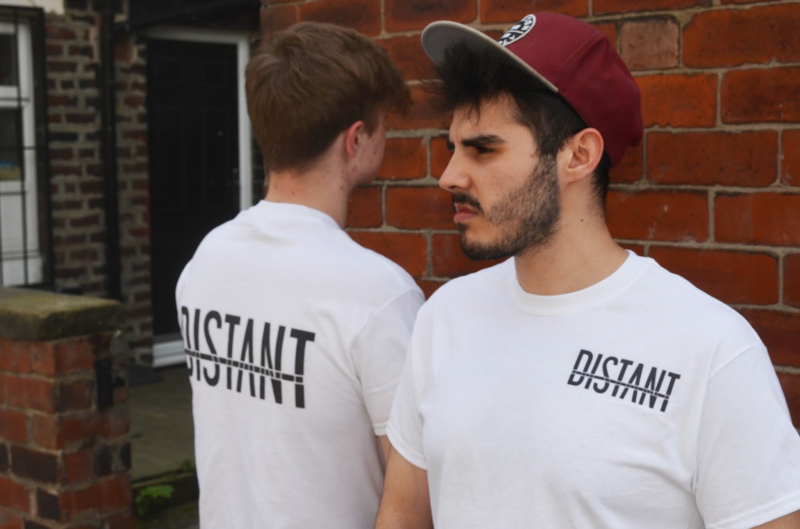
I also feel as if the word distant relates to an optical illusion which focuses on the distance within the image; optical Illusions can use color, light and patterns to create images that can be deceptive or misleading to our brains.
I would like to create something that shows distance (Distant) within the image to represent the two artists working away from their home country, Spain. Their first album is called ‘US’ therefore it’s important to highlight the factor that this album is all about them and since it is their first album it needs to be more personal and welcoming. 

Equalizers are software or hardware filters that adjust the loudness of specific frequencies. As with all sound engineering, the basis is on the human ear. Certain frequencies are louder than others to our ears, despite having the same or even more energy behind it.
Since the artists want a logo for their branding, I have decided to look further into sound waves/bars/equalizers. This is what constantly changes throughout the song to create different frequencies. 

I intend to play around with sound waves/bars to create a logo. 


Musical Equipment
After viewing Distants promotional video, 
We Don’t Talk Anymore - Distant Version (Charlie Puth), I noticed that they use a lot of a musical equipment. 

The artists from Distant use various electronic equipments however, they use mini jacks the most throughout their sets as this is what allows them to create music and listen back to their own music. 

The artists wanted their logo to be unique and I wanted to give them some personality behind their branding therefore I am going to design some logos that work alongside their musical equipment. 

Monday 2 January 2017

OUGD603 - Distant branding - Research

My first bit of research is understanding the artists and what they have given me to work with. 
Firstly, Kyle and Danny are both bestfriends from their home country Spain, Sotogrande, city in Galicia. They both have lived there and have come to the UK to gain a bigger understanding about the music industry. 
This is where the name ‘DISTANT’ has come from; both coming from a distant country and still working together from a distant. Danny currently studies in London, whereas Kyle studies in Leeds. 
This gives me more chance to work closer with both artists as one is from Leeds where I study whilst danny  is close to my home town in London. 


Sunday 1 January 2017

OUGD603 - Distant Branding - Brief

Third year LCA music students have approached me to create the branding for their new upcoming band. 
I have been given an open brief and will be contacting the two artists constantly throughout London and Leeds. The logo must consists of the words Distant in a word/image format. 
Background
Distant are a music brand that have been working together since they met in Spain. They have both moved from Spain to the UK where they have gone individual directions (London and Leeds) to pursue their ambitions. They are now forming together after 3 years apart in education and would like me to create their branding. 
Deliverables
- Logo
- Business Cards

CONCEPT FOR THE BRIEF

Distant are two DJ’s who have share a love for music. They both have individuals styles however, when they join together they form electronical music like never heard before. I am going to use this inspiration to create a brand identity that will help Distant improve on their current logo. Using electrical research I will be creating a neat, musical logo.