After looking at several books, layout was something that had to be balanced, refined and original. This book is about coffee shops that are located in Poland, they are also put in order of the alphabet.

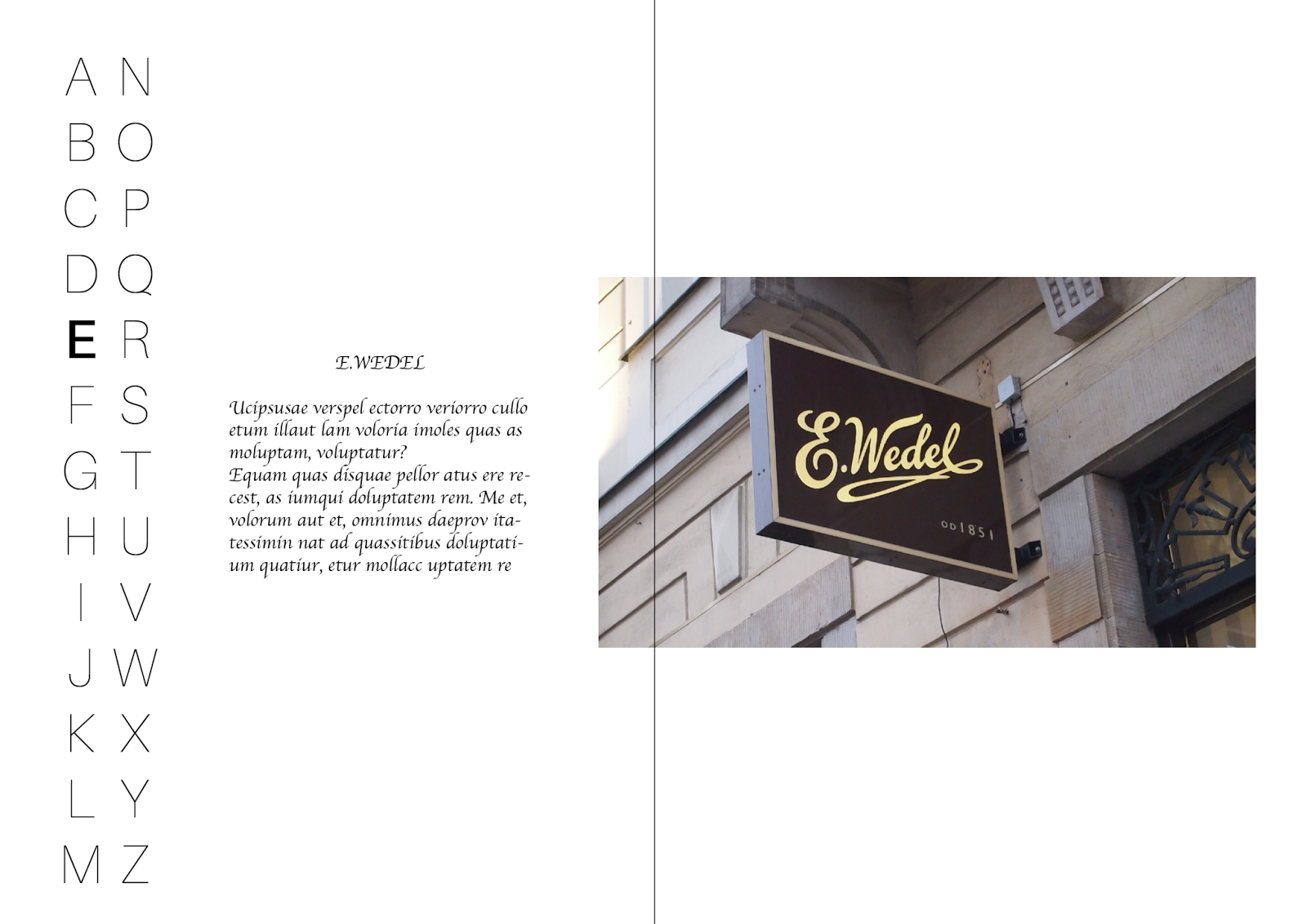
This layout is made with the intention of making half of the alphabet on each paper. This then centers the image in the middle of the two pages. Although the image is very clear and has white space around it, the line down the middle signifies where the paper will crease from the fold.


The layout is influenced through the layout above. The images are a lot smaller and this balances with the type on the left. The image is very easily visible whilst the relevant information is placed on the left out of the way of the photograph.
This layout is very minimalistic and proportionate. The photograph is spread across the whole page to show the viewer that this book is a photography based book. The importance of the alphabet started to fade because it doesn't seem very relevant and now this can be replaced with white space which makes the photograph more eye catching.

Similar to the layout above, the image is made smaller to fit the margins of the book. The white space around the image makes it look more refined and stylish. The type is now set on the bottom left to make the image stand out more and make it more elegant and distinct. The book is not really meant to be proportionate because coffee isn't exactly proportionate with how it comes and smells. Each coffee is unique and this is something that has to be shown within the publication.

This layout shows the importance of the photograph by going across two pages and constantly linking it back with the text in the bottom right. The type in the bottom right is there to give information about the photograph and where it is located. Page numbers were added in the top right with the idea that there will be a contents page at the start of the book. This would make it easier for the reader to check out coffee shops based on their alphabet.

No comments:
Post a Comment