Sunday, 22 November 2015

OUGD504 - Studio Brief 04 - Research

Wireframes is something that I wasn't aware of as a designer. Websites too are something very new to me. I looked at a basement wireframe kit to see how designers are wireframing their websites. 
It is a very simple outline of what is going to be done on the website. 
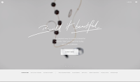
Looking at recent website designs (www.siteinspire.com) has helped to understand how websites work and what is happening on websites. The website in general is very easy to use and shows various different website ideas that were used throughout the last few years.  


Looking at this website, it was very interactive and was constantly changing therefore making it more interesting to look at. Looking at a website that is interactive and easy to understand makes you want to stay on the website; I would like to use this within my design. 
This is a website that is very interactive (www.kenjiendo.com) When you hover over the letter K it changes into various lines that create the letter K. The website in general is easy to use and has a theme running throughout. The website uses little colour and has a monochrome feel to it. 
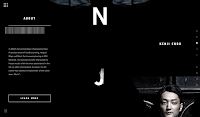
Everything is interactive. The website uses a lot of javascript animation which is something that I would like to learn. I really like the bold typeface going throughout the middle of page. Everything within the website is layed out on the side whilst his name KENJI ENDO is down the center of the page.


Friday, 20 November 2015

Parallax - Designing for digital

10 tips for designing for digital output. 
info@parall.ax

1. Wireframing
- Makes things easier, giving yourself space by separating the entire thorught process and UX considerations from the visual design. 
- Focus on the fun stuff. 
- Communicate your ideas.

Useful tips:
- You want to map out the UX. 
- Sketch 
- Photoshop

1b. Responsive device
- Mobile - 320px bt 565px
- Desktop 1600px by 1000px

Learn your canvas sizes. 
Use grid systems. 

2. Fonts
- Not all fonts are available for web.
- Make sure that the font is available for license. 
Helpful tips: typekit and fonts.com and google fonts

4. Organisation 
- Organise your files 
- Keep everything together and name each thing you do correctly. 

5. Research 
- Look at functionality and new web trends, colours and typography. 
- Identify competitors and benchmark against similar brands. 
- Look at user personas - know your target audience. 

6. Retina/ High DPI. 
- The web supports vectors now. They will always be rendered as pixels so be aware. 
- Using smart objects. 
- Choose your software wisely. 
- Double up. When designing for retina you should double pixel sizes in Photoshop. 
- Provide multiple sizes. Raster items. images should be provided in multiple sizes for high and low resolutions screens. 

7. Interactivity 
- Create animations yourself in After Effects/Adobe Edge etc. Give them an idea you want them to move or react. Don't make it too distracting 

8. Understanding 
- You should have an understanding of how things function and what is realistically possible. 

9.
You need to build a relationship between the user and the product. This will create trust and make it easier to navigate around the website and make it more more 

10. Compromise 
- Be prepared with outrageous comments and requests. 
- Offer explanations 
- Ask for examples from the client that might help you build something better for the client. 

-------------------------------------------------------------------------------------------------------------------------


User Experience

User experience.

What is UX?
Research and testing, Behavioural psychology, Date Analysis, Personal development, Product design, Requirement gathering, Information architecture,
Nomenclature, Copy writing, Tone of voice, Problem exploration, Solution discovery, Prototyping, Interaction design, Interface design, Responsive,
Performance, Visual design, Brand, Marketing and comms, Customer service, Design culture.

> Research > Design > Validate > Moderate >

There is a rise of the Digital Native
-       We all have access to a phone or something electronic.
-       We're more connected to each other than we have ever been and its not going to stop.
Step 1 – Identify your users
-       Lean Personas
-       15 minutes low investment, low risk. Zero waste
-       Team sport
-       Validate and Iterate
Step 2 – Research
-       FOG = Fact, Opinion or guess
-       Surveys
-       Face to face (Coffee shop test)

-       Observation (Be where your users are)

Thursday, 19 November 2015

OUGD504 - Studio Brief 03 - Final Outcome

Here is the final publication. The changes that were made came from feedback sessions. In the final crit, colleagues said that my images were too small and that there is no need for page numbers.  After playing around with layout, this layout seemed the most interesting, original and stylish. 

The limitation that I found difficult with was playing around with my coffee stained paper. It was an idea that would work well with this book as it would make it relevant to have a coffee book smelling of coffee. 


OUGD504 - Studio Brief 03 - Research (Binding)

This book is a Japanese stab binding. By binding a book this way it allows you to create each page differently, even using different paper stocks and sizes. The pages need to be aligned the same for this binding to work. The disadvantage for this book is that this method does not allow for the book to be open fully without closing in on itself. 
This is a binding that is not seen very often. Although the name of this binding couldn't be found it is something that would be interesting to make. This binding looks like it is consisting of 3 small books being produced separately to be bound together using this technique. 


Monday, 16 November 2015

OUGD504 - Studio Brief 03 - Further Development


Here are the two best pages from my coffee book.  Each page is written in both Polish and English saying where the place is and how to contact them. The type colour is a very subtle grey to help the photograph stand out more.


Here, the type is bundled together and would have a description of the coffee shops. The alignment is in the centre to make it easier for the viewer to read and to distinguish which type goes with which image, although it is very easy to recognise. 


Here are another two pages that were used to not play around with the same two pages. These two pages have a line going through the side of each text. This line is to give the type more depth and to make it stand out from the alphabet on the left. The alphabet on the left has been sized down and is put there to see how the layout looks with an alphabet on its side. Although, the alphabet will not be used on the final publication. 

Friday, 13 November 2015

OUGD504 - Studio Brief 03 - Development

 After looking at several books, layout was something that had to be balanced, refined and original. This book is about coffee shops that are located in Poland, they are also put in order of the alphabet.

This layout is made to outline the importance of the image. The image is put across two pages to give the viewer the chance to see the type in context. What works well in this layout is that the picture is very clear and minimal. The type is on the right hand side of the page because it is information about the coffee shop itself. The alphabet is placed at the bottom to give the information some white space. 
This layout is made with the intention of making half of the alphabet on each paper. This then centers the image in the middle of the two pages. Although the image is very clear and has white space around it, the line down the middle signifies where the paper will crease from the fold. 
Playing around with layout and making sure that everything isn't random. The alphabet is on the left hand side whilst the majority of the image is on the right. This gives the layout more freedom to play around with type. Although both text box's will not be used, they are there to show two variations of each layout and how type can be read. 
The layout is influenced through the layout above. The images are a lot smaller and this balances with the type on the left. The image is very easily visible whilst the relevant information is placed on the left out of the way of the photograph. 
This layout is very minimalistic and proportionate. The photograph is spread across the whole page to show the viewer that this book is a photography based book. The importance of the alphabet started to fade because it doesn't seem very relevant and now this can be replaced with white space which makes the photograph more eye catching. 
Similar to the layout above, the image is made smaller to fit the margins of the book. The white space around the image makes it look more refined and stylish. The type is now set on the bottom left to make the image stand out more and make it more elegant and distinct. The book is not really meant to be proportionate because coffee isn't exactly proportionate with how it comes and smells. Each coffee is unique and this is something that has to be shown within the publication. 
This layout shows the importance of the photograph by going across two pages and constantly linking it back with the text in the bottom right. The type in the bottom right is there to give information about the photograph and where it is located. Page numbers were added in the top right with the idea that there will be a contents page at the start of the book. This would make it easier for the reader to check out coffee shops based on their alphabet. 


Thursday, 12 November 2015

OUGD504 - Studio Brief 03 - Research

Pinterest has a lot of page layout designs that have been published by other artists. This gives graphic designers an opportunity to browse through these books and see 'things' that could inspire them. Here are a few designs that have helped me to develop an idea for my publication.


This book focuses on the contrast between black and white with a subtle colour used in each page. The page layout itself is very minimal with the use of a border surrounding a few words. This page layout makes the book look like a lookbook and not something that you would throw away.
The book has a flat tone, meaning it has no tonal effect. The layout on the left hand side of the page feels as if the model is hidden within this border whilst the other model on the right hand side has an open approach and feels more free. The image is spread across the whole page making the image the centre of attention and this is something that could be enhanced during the publication stage. 


What makes this a good publication is the white space giving the image space to breath and be the centre of attention when flicking through this book. This lookbook is based on images whilst being supported by two columns. 


There is a gentle touch with this book as the image is very minimal complimenting the neutral type on the other side of the page. The simplicity of the book makes you want to flick through the book and see what is on the other pages. The choice of grey and white work well together, complimenting one another.


The use of vibrant colours in the image makes the text on the other side stand out. Although the text is black, a colour such as white would contrast the background colour of the image and potentially give it more depth. 


This is another publication found on Pinterest. This publication has an image on the left with the relevant information on the other side. The 'thing' that works here is the simplicity and the use of a grid. Although both pages have different layouts they both stick to a grid system. This helps the designer to place relevant information in different areas without changing the whole page layout and keeping the publication consistent throughout. This is something that should be taken into consideration when producing a publication as you don't want to keep having to readjust your eyes as the viewer/reader might get bored and stop reading through your book. 


This publication uses simplicity within layout and in colour to help enhance the book. The contrast between the pages works well together and maintains a theme throughout. This is a book that looks very clean and precise and focuses on a certain page each time. Each page has either a massive letter or an image that will be focused on. What works best on this publication is that each page is different but still works. It is as if each page has a story of its own, and this is something that as a graphic designer could benefit you. 


This is a book that is based on simplicity of the photograph and type. The type looks hand rendered which makes it look delicate, distinct and elegant. This book contains a lot of white space which makes you focus on the photograph. This is something that could be presented when creating a book about coffee shops. 


When looking at front covers simplicity is the key. A front cover has to be eye catching, creative and recognisable. This front cover is very vibrant and attracts your eye to open it. The minimalism makes this book stand out. The minimalism comes from a square image being surrounded by patterns that give the image a bit more depth.